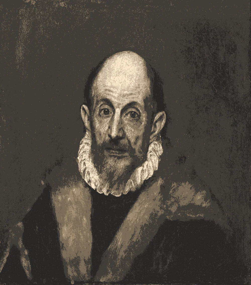
This palette comes from Joos van Cleve's The Last Judgment, painted on wood around 1525 to 1530 and held by The Metropolitan Museum of Art. Its warm browns, deep red and olive green suit rooms that want a grounded, cozy scheme with one light wall to hold the space open.
Quick answer
Use the light parchment shade on the main walls, the olive green as the main color on a feature wall or cabinetry, and the burnt umber and deep brick red for accents such as pillows, art, or a rug. Keep the very dark espresso for small details like trim, a door, or a deep shelf.
Joos van Cleve, The Last Judgment, ca. 1525–30.
The Metropolitan Museum of Art, open access.
The bar shows each color's measured share of the canvas.
The 6 colors in this painting
Measured from the image and ordered by how much of the canvas they cover. LRV is how much light a color reflects, from 0 for black to 100 for white.
Deep espresso brown
#2D2218 · 43% · LRV 2
Warm parchment beige
#DCC4B0 · 18% · LRV 58
Burnt umber brown
#754A34 · 14.2% · LRV 9
Olive moss green
#7B784D · 11.9% · LRV 18
Warm oak brown
#916146 · 11.4% · LRV 15
Deep brick red
#88271C · 1.5% · LRV 7
Where each color lives in the painting
Left, every pixel of the canvas snapped to its nearest palette color. Right, the detail where each color is strongest.
The same scene in 6 flat colors.
Deep espresso brownWarm parchment beigeBurnt umber brownOlive moss greenWarm oak brownDeep brick red
Closest paint colors
The nearest color from each brand. “Near-identical” and “Very close” are hard to tell apart on a wall; with “Similar”, compare a sample with the painting. Brands with nothing close are left out.
Painting color
Closest paints
LRV
Use it for
Deep espresso brown #2D2218
Sherwin-Williams SW 6006 Black Bean
Similar
Behr 780B-7 Bison Brown
Similar
Farrow & Ball No. 256 Pitch Black
Similar
2
Small accents, art, accessories
Warm parchment beige #DCC4B0
Sherwin-Williams SW 7712 Townhouse Tan
Very close
Behr PPU3-08 Sienna Dust
Very close
Valspar 3001-10B Milk Toast
Very close
Farrow & Ball No. 231 Setting Plaster
Very close
58
Main walls
Burnt umber brown #754A34
Behr BXC-42 Bricktone
Very close
Sherwin-Williams SW 9100 Umber Rust
Close
Valspar 2011-6 Cowboy Suede
Close
9
One bold piece
Olive moss green #7B784D
Valspar 6006-6C Olivita
Very close
Behr N310-6 Palm Desert
Close
Sherwin-Williams SW 7729 Edamame
Close
Farrow & Ball No. 298 Bancha
Similar
18
Bed, sofa, curtains
Warm oak brown #916146
Behr S210-6 Cinnamon Crunch
Very close
Valspar 3011-7 Sienna Red
Very close
Sherwin-Williams SW 45 Antiquarian Brown
Close
Farrow & Ball No. 42 Picture Gallery Red
Similar
15
Wood and frames
Deep brick red #88271C
Behr S-H-200 New Brick
Close
Sherwin-Williams SW 6335 Fired Brick
Close
Valspar 1009-4 Cut Ruby
Similar
7
One small textile
Paint names belong to their brands. Matches are measured from screen colors and are approximate; Light & Pigment is not affiliated with any paint brand.
How warm parchment beige looks in your light
The wall color shifted for the light it will live in. Check the version closest to your room before buying a sample.
North-facing room#C5B9B1
In north light the parchment wall reads a little cooler and softer, with its warm red-orange undertone easing back. Its light reflectance of 58 keeps it bright, though it sits just under the level where a wall feels fully light.
South-facing room#E4CBB3
Strong south light lifts the parchment wall and brings out its warm red-orange undertone, so it can look golden by midday. Its reflectance of 58 bounces a good amount of that light around the room.
Evening, warm lamps (2700K)#BEA182
Under warm evening bulbs the parchment wall takes on a richer, honey-toned glow, and the olive green looks warmer and deeper. The burnt umber and brick red become more saturated, so test accent pieces under your own lamps before buying.
Try the palette in a room
Pick which painting color goes on the walls, the big furniture and the bold piece. Floors, shadows and light follow your choices.
Wood takes Warm oak brown and the rug border takes Deep brick red in every combination.
Mood board
Details from the painting next to the colors and materials that carry them into a room.
Warm parchment beige
Olive moss green
Burnt umber brown
LinenOiled oakLime plasterAged brass
Save this palette
A card with the painting, all 6 colors and a room scheme. Pin it, or take it to the paint store.
Can I paint a whole room in the very dark espresso shade?
You can, but the espresso reflects very little light, with a light reflectance of 2. It works best in a room with plenty of daylight or several lamps, and it is better suited to a den, dining room, or powder room than a small space with little window light.
Which color should I use on the walls of a small room?
Use the warm parchment beige on the walls. Its light reflectance of 58 keeps a small room feeling open, and the darker colors can go on furniture, textiles, or one accent wall.
Does the olive green work with the warm beige and browns?
Yes. The olive green has a warm yellow undertone, while the beige and browns lean red-orange, so the group stays in the same warm family. Use the olive on one wall or on cabinetry and let the beige and browns carry the rest of the room.
Image: The Metropolitan Museum of Art, Public domain (CC0).
Palette, posterized image, details and room views generated by Light & Pigment from that image.
Colors look different on screen than on a wall, so always test a sample.