North-facing room
#DBC0A6North light turns the browns a little gray, so choose warmer samples for a north-facing room.
Paint colors for your home, inside and out
19th-century American painting · art-to-room palette
Warm autumn browns, from a deep umber to a peachy gold. The palette suits a cozy living room, a den or a bedroom with wood furniture.
Quick answer
Use the pale peach #FECF9E on the walls, #B7976D on the main furniture and #907155 as an accent. Keep #A17D58 for wood.

Measured from the image and ordered by how much of the canvas they cover. LRV is how much light a color reflects, from 0 for black to 100 for white.
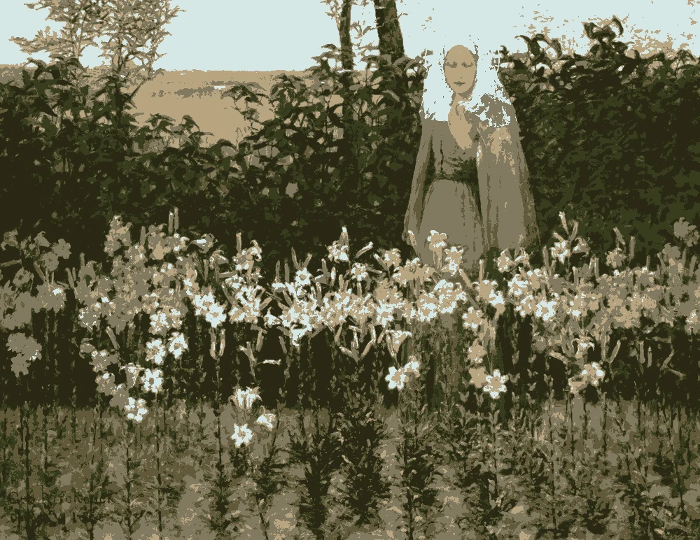
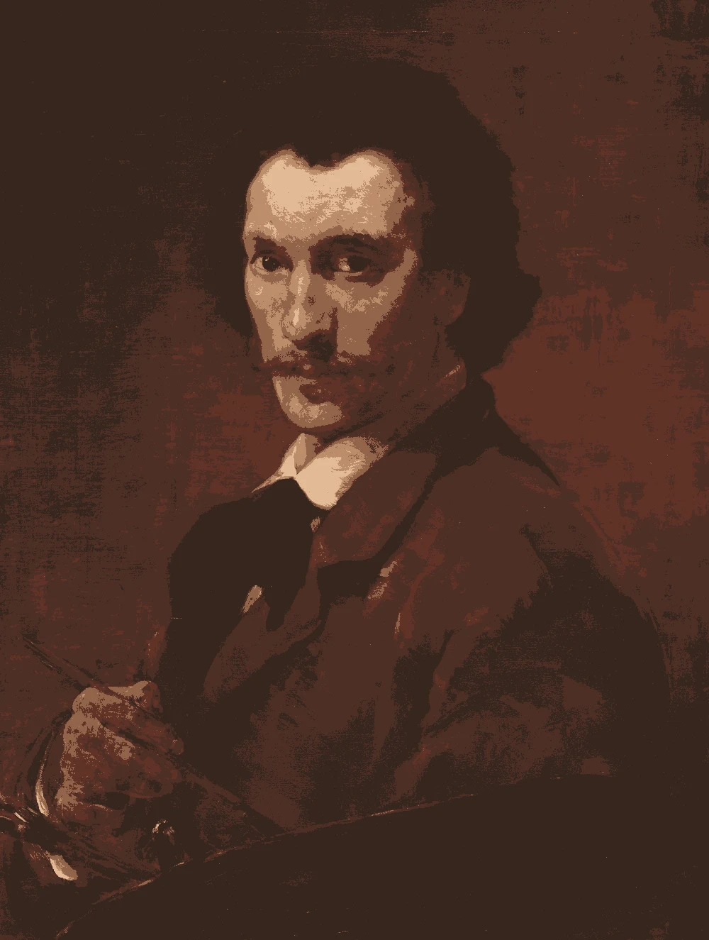
Left, every pixel of the canvas snapped to its nearest palette color. Right, the detail where each color is strongest.


The nearest color from each brand. “Near-identical” and “Very close” are hard to tell apart on a wall; with “Similar”, compare a sample with the painting. Brands with nothing close are left out.
| Painting color | Closest paints | LRV | Use it for |
|---|---|---|---|
Autumn bark#907155 |
|
18 | One bold piece |
Copper wood#A17D58 |
|
23 | Wood and frames |
Deep russet#7A614E |
|
13 | One small textile |
Straw tan#B7976D |
|
33 | Bed, sofa, curtains |
Sandstone gold#C89966 |
|
36 | Main walls |
Dark clay#594C46 |
|
8 | Small accents, art, accessories |
Paint names belong to their brands. Matches are measured from screen colors and are approximate; Light & Pigment is not affiliated with any paint brand.
This painting has no light tone, so the wall color above is a lightened version of its palest color (#FECF9E).
The wall color shifted for the light it will live in. Check the version closest to your room before buying a sample.
#DBC0A6North light turns the browns a little gray, so choose warmer samples for a north-facing room.
#FED4A5South light brings out the red-orange in #907155 and #7A614E and makes the walls feel warm.
#D2A878Warm bulbs deepen the whole palette and give the room a firelit feel.
Pick which painting color goes on the walls, the big furniture and the bold piece. Floors, shadows and light follow your choices.
Wood takes Copper wood and the rug border takes Deep russet in every combination.
Details from the painting next to the colors and materials that carry them into a room.

A card with the painting, all 6 colors and a room scheme. Pin it, or take it to the paint store.
The painting has no light tone, so the site lightened its palest color to #FECF9E. It is a suggestion rather than a measured color.
Yes. Each has a warm yellow or red-orange undertone, so they blend easily.
The mid-tones #A17D58 and #B7976D sit close to natural wood and work well beside it.
Image: The Art Institute of Chicago, Public domain (CC0). Palette, posterized image, details and room views generated by Light & Pigment from that image. Colors look different on screen than on a wall, so always test a sample.