Young Woman with a Water Pitcher Color Palette & Paint Colors
This palette pairs a soft gray-beige and a creamy off-white with deep brown, ink navy, slate blue and a muted brick red. It suits a calm, grounded room such as a living room, a study or a bedroom where you want warmth without brightness.
Quick answer
Use the cream #EBDCC5 on the walls, the gray-beige #B8B2A0 on large furniture, rugs or a second wall, and the brown #6A5941 for wood and trim. Keep the navy #152032 for one accent, and the slate blue and brick red for small touches like pillows and throws.
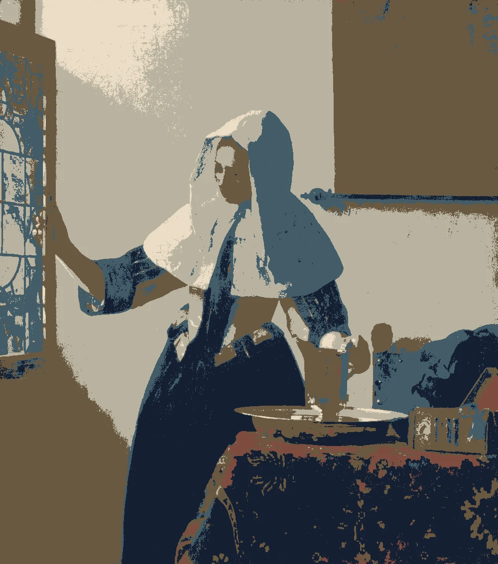
Johannes Vermeer, Young Woman with a Water Pitcher, ca. 1662.
The Metropolitan Museum of Art, open access.
The bar shows each color's measured share of the canvas.
The 6 colors in this painting
Measured from the image and ordered by how much of the canvas they cover. LRV is how much light a color reflects, from 0 for black to 100 for white.
Soft Gray Beige
#B8B2A0 · 32.8% · LRV 45
Deep Walnut Brown
#6A5941 · 29.9% · LRV 11
Ink Navy
#152032 · 21% · LRV 1
Slate Blue
#435C69 · 10.6% · LRV 10
Warm Cream
#EBDCC5 · 4.3% · LRV 73
Muted Brick Red
#7E4C3F · 1.3% · LRV 10
Where each color lives in the painting
Left, every pixel of the canvas snapped to its nearest palette color. Right, the detail where each color is strongest.
The same scene in 6 flat colors.
Soft Gray BeigeDeep Walnut BrownInk NavySlate BlueWarm CreamMuted Brick Red
How to use each color
Color values measured from the painting, with the role each one plays in a room.
Painting color
HEX
LRV
Use it for
Soft Gray Beige
#B8B2A0
45
Bed, sofa, curtains
Deep Walnut Brown
#6A5941
11
Wood and frames
Ink Navy
#152032
1
One bold piece
Slate Blue
#435C69
10
Small accents, art, accessories
Warm Cream
#EBDCC5
73
Main walls
Muted Brick Red
#7E4C3F
10
One small textile
How warm cream looks in your light
The wall color shifted for the light it will live in. Check the version closest to your room before buying a sample.
North-facing room#CFC9BE
The cream wall #EBDCC5 has an LRV of 73, so it still reflects plenty of light, but north light is cool and may pull it toward a grayer, flatter look. Add warm wood and a few brick red accents to keep the room from feeling chilly.
South-facing room#EFDEC4
In strong south light the cream will read bright and clearly warm, and its yellow undertone will show most at midday. It works well here, and you may want the softer gray-beige #B8B2A0 if the cream feels too sunny.
Evening, warm lamps (2700K)#C7AF8E
Warm bulbs will push the cream toward yellow and make it feel cozy. The deep brown and navy will absorb much of that light, so add a lamp or two near them so they do not disappear.
Try the palette in a room
The palette applied to three rooms.
Mood board
Details from the painting next to the colors and materials that carry them into a room.
Warm Cream
Soft Gray Beige
Ink Navy
LinenOiled oakLime plasterAged brass
Save this palette
A card with the painting, all 6 colors and a room scheme. Pin it, or take it to the paint store.
Which colors from this palette work best on the walls?
The cream #EBDCC5 is the best wall color, with an LRV of 73 that keeps a room bright. The gray-beige #B8B2A0, at LRV 45, suits a second wall or a room with plenty of daylight.
Can I use the dark navy on a whole wall?
You can, but the navy #152032 has an LRV of 1, so it reads almost black and absorbs most light. It suits a small room or a single wall with good lighting, and it is easier to live with as an accent on a door, a built-in or a piece of furniture.
How do I use the brown and brick red without making the room feel heavy?
Keep both to small areas. The brown #6A5941 (LRV 11) fits wood floors, trim and furniture, and the brick red #7E4C3F (LRV 10) works as a textile or a few accessories. The light cream walls will balance them.
Image: The Metropolitan Museum of Art, Public domain (CC0).
Palette, posterized image, details and room views generated by Light & Pigment from that image.
Colors look different on screen than on a wall, so always test a sample.