A contemporary living room works best with a quiet base, one or two grays and a single cool accent. These six colors define the Modern style and were each measured from a painting, so you can see how real pigment behaves.
Quick answer
Use the warm white #EFE2D2 on the walls, the mid gray #A7A7A7 on the sofa or built-ins and the blue #81AAB3 for one accent wall or a chair. Keep #1C1A18 and #373838 for frames and metal.
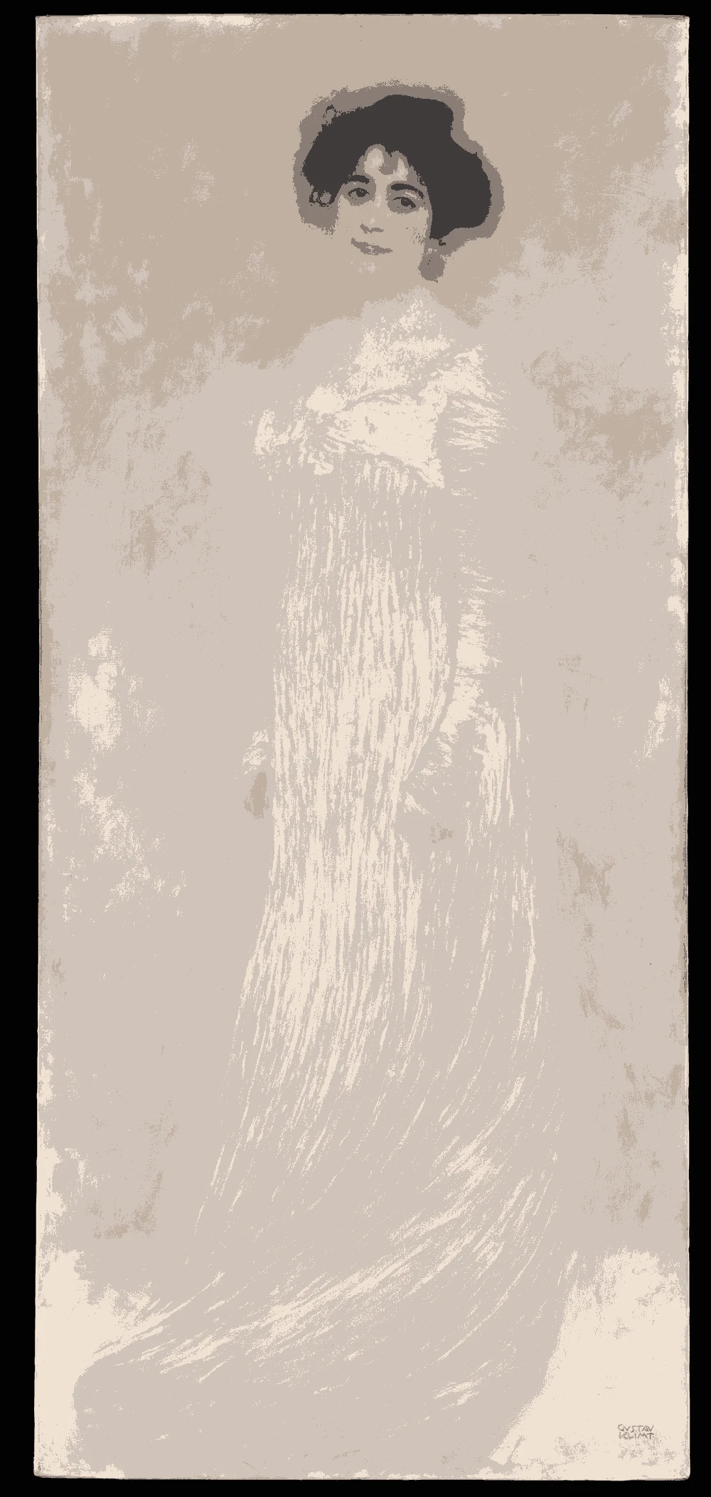
Every color on this page was measured from one of these public-domain paintings.
The palette
#EFE2D2LRV 77
Warm Linen White
A very light color with a warm yellow undertone and an LRV of 77, good for living room walls that need to reflect light. It comes from Gustav Klimt's Serena Pulitzer Lederer, and Sherwin-Williams SW 6343 Alluring White is a near-identical match.
Sherwin-Williams SW 6343 Alluring White
Near-identical
Farrow & Ball No. 2008 Dimity
Near-identical
#A7A7A7LRV 39
True Mid Gray
A neutral gray with an LRV of 39 and no clear undertone. It suits a sofa, a rug or a media wall. It was measured from Anna Claypoole Peale's Portrait of a Woman, and the closest match is Sherwin-Williams SW 7659 Gris.
A light color with a warm yellow undertone and an LRV of 44. It works as a soft wall for a TV area or as a textile. It comes from Aelbert Cuyp's Landscape with the Flight into Egypt.
A very dark neutral with an LRV of 1 and no close paint match. Use it for picture frames, a TV surround or metal details. It was measured from George Healy's Self-Portrait.
A very dark neutral at LRV 4, suited to a feature wall behind a TV or a bookcase. It comes from Edgar Degas's Café Singer, and Sherwin-Williams SW 6994 Greenblack is a near-identical match.
A mid-tone with a cool blue undertone and an LRV of 37, good for an accent wall or an armchair. It was measured from Francesco Guardi's Fantastic Landscape, and Sherwin-Williams SW 9057 Aquitaine is a near-identical match.
The same paint reads differently in cool north light, warm south sun and under evening lamps. Find the column closest to your room.
Color
Neutral daylight
North light
South light
Evening lamps
Warm Linen White
True Mid Gray
Pale Sage Khaki
Glacier Blue
Try these colors in a room
Pick which color goes on the walls, the big furniture and the bold piece. Floors, shadows and trim follow your choice.
The framed picture on the wall is Serena Pulitzer Lederer (1867–1943).
Which colors work best for a modern living room?
Modern rooms depend on contrast that is controlled. Start with a light wall, the warm white #EFE2D2 at LRV 77, then add a neutral such as the mid gray #A7A7A7 for large furniture.
Choose only one color accent. The blue #81AAB3 has an LRV of 37 and a cool undertone, so it stands out against the warm wall without clashing. The pale sage #B5B29E is a quieter option if you prefer green.
Use the near-black tones last. Both #1C1A18 and #373838 are very dark, so they are best in small, sharp pieces such as frames, lamp bases or a single wall behind a TV. Three or four colors from this list are enough for a whole room.
How do you do a modern accent wall in a living room?
An accent wall works best on the wall your eye reaches first, often the one behind the sofa or the TV. For a quiet result, use the blue #81AAB3 and keep the other walls in the warm white.
For a bolder result, use the charcoal #373838 behind a TV. Dark walls hide cables and reduce screen glare, and the contrast with warm white walls looks deliberate. Make sure the room has enough daylight, since a color with LRV 4 absorbs most of it.
Keep trim and ceiling in the light color so the accent has clean edges. If you are painting a TV wall dark, add lamps on both sides and a lighter rug so the room does not feel closed in.
What goes with these colors: trim, ceiling and flooring?
For trim and ceiling, the warm white #EFE2D2 is enough. If you want a sharper line, choose a white that has less yellow in it, but test it against the wall because it can look gray beside a warm base.
For flooring, mid-tone wood warms the cool gray and blue. The suggested wood tone for this palette is #8B6B4A. A light gray or beige carpet works well with the sage and warm white.
Brown furniture also fits. The warm undertone in the wall and sage colors links with it, and the mid gray gives a neutral buffer. Metal in black or brushed steel matches the near-black tones. Avoid adding a second strong color, since this palette relies on restraint.
How should you test modern paint colors?
Paint two large samples, one of the wall color and one of the accent, and tape them on different walls. Look at them in the morning and in the evening.
North light makes the blue #81AAB3 look cooler and the warm white a little grayer. South light makes the warm white clearer and the blue lighter. Evening bulbs add yellow, so the sage and the warm white look warmer than they do by day.
Live with the samples for a few days. The mid gray #A7A7A7 can look bluish or brownish depending on what is near it, and your sofa color will decide which. Choose the final colors only after seeing them beside your furniture, floor and curtains.
FAQ
What paint colors are modern for a living room?
Warm whites, true grays and one cool accent such as blue or sage are typical. The palette here uses #EFE2D2, #A7A7A7 and #81AAB3.
Can I paint a living room gray?
Yes. A mid gray like #A7A7A7 has an LRV of 39, so it reads fairly dark on a whole room. It looks better on furniture or on one wall.
What color goes with brown furniture in a modern room?
Warm white walls and a pale sage tie in with brown furniture. The blue accent adds contrast without competing.
Is a dark TV wall a good idea?
A charcoal wall such as #373838 reduces glare and hides cables. Keep the other walls light so the room stays bright.
How many colors should a modern living room have?
Three or four are enough: a light wall, a gray, one accent and a dark detail color.
Save these colors
A card with every color on this page, its LRV and the paintings it comes from. Pin it, or take it to the paint store.
Painting images: The Metropolitan Museum of Art, The Art Institute of Chicago, public domain (CC0).
Colors measured by Light & Pigment. Paint names belong to their brands and matches are approximate. Colors look different on screen than on a wall, so always test a sample.


 From Serena Pulitzer Lederer (1867–1943), Gustav Klimt