Gray and White Bedroom Walls: Shades and Accent Colors
Gray and white bedroom walls look best when the whites have a visible undertone and the grays have real depth. Here two grays (LRV 21 and 10) are paired with two soft whites (LRV 74 and 77) and three accent colors.
Quick answer
Paint the walls in the pale green-white or warm white, use the mid gray on one wall or on bedding, and add the soft blue, steel blue or dark brown as an accent.
Every color on this page was measured from one of these public-domain paintings.
Grey and white
#7E7E7ELRV 21
Mid Gray
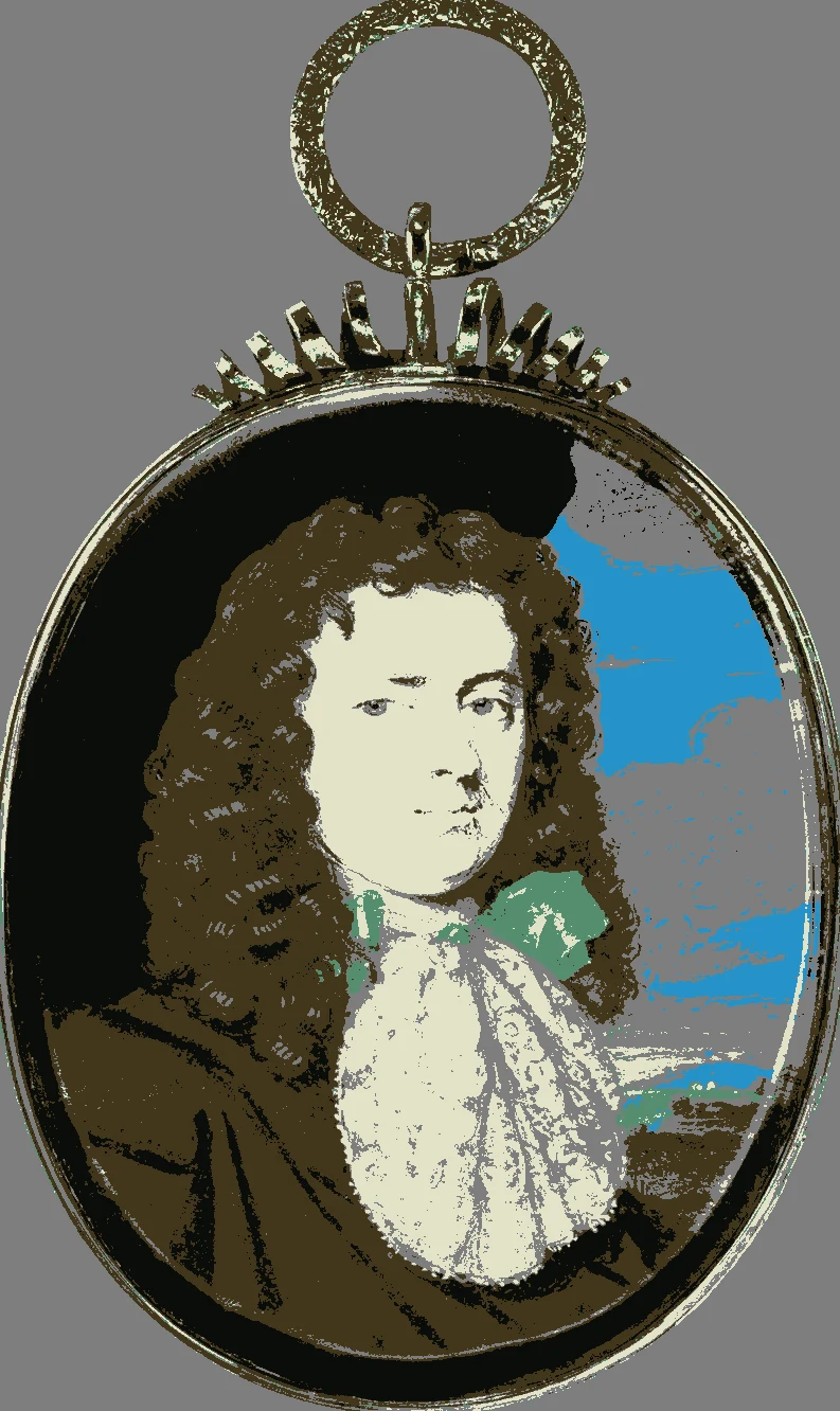
A mid-tone neutral gray at LRV 21, close to Sherwin-Williams Westchester Gray. Use it on one wall or on a headboard. Measured from Thomas Flatman's Portrait of James Butler, 1st Duke of Ormond.
A deep neutral at LRV 10, near-identical to Sherwin-Williams Peppercorn. It suits a feature wall, curtains or a bed frame. Measured from Ammi Phillips's Mrs. Reuben Allerton (Lois Atherton).
A very light white with a green undertone at LRV 77. It keeps a gray room fresh and bright. Measured from Jean Baptiste Édouard Detaille's A Mounted Officer.
Sherwin-Williams SW 6140 Moderate White
Near-identical
Behr HDC-CT-05 Pale Palomino
Near-identical
Valspar 3001-8C Manila Cream
Very close
Farrow & Ball No. 2008 Dimity
Very close
Colors to pair with them
#BACBCBLRV 58
Pale Blue-Gray
A light cool blue at LRV 58 that works as a wall color or in linens. The nearest match is Sherwin-Williams Sleepy Blue. Measured from Théodore Rousseau's Springtime.
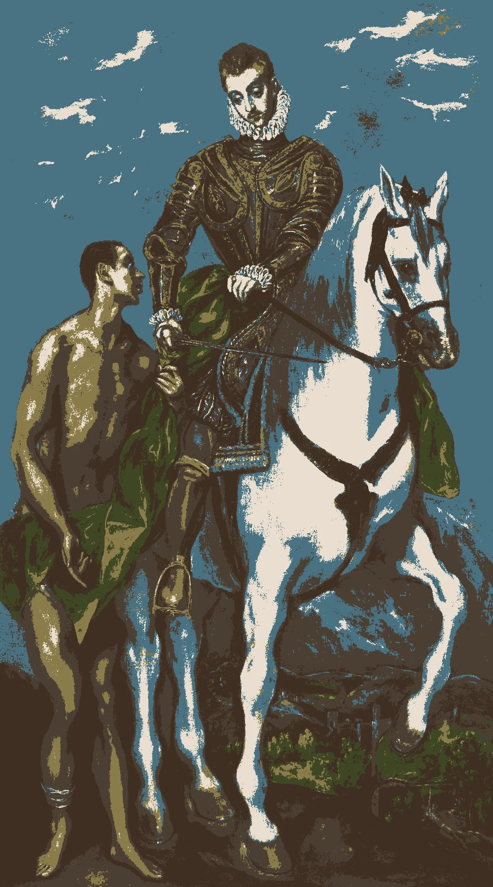
A deep cool blue at LRV 15, close to Sherwin-Williams Inky Blue. Use it for a bold piece such as a velvet bench or curtains. Measured from Saint Martin and the Beggar.
The same paint reads differently in cool north light, warm south sun and under evening lamps. Find the column closest to your room.
Color
Neutral daylight
North light
South light
Evening lamps
Green White
Warm White
Pale Blue-Gray
Try these colors in a room
Pick which color goes on the walls, the big furniture and the bold piece. Floors, shadows and trim follow your choice.
The framed picture on the wall is Portrait of James Butler, 1st Duke of Ormond (1610-1688).
Which gray and which white should you pick?
The grays here are both neutral, with no clear undertone, so they will not drift toward blue or purple the way some grays do. The mid gray (#7E7E7E) is the lighter choice and the charcoal (#5B5856) is the deeper one at LRV 10.
The whites differ by undertone. The green white (#E0E5D5) feels fresh and slightly cool. The warm white (#E9DECF) feels softer. Choose the warm white if your bedroom has cool light or gray flooring, and the green white if the room is sunny and warm.
A simple plan is to put a white on three walls and the mid gray on the wall behind the bed. The charcoal then appears in smaller doses, such as curtains or a bench, so the room does not feel heavy.
What accent color goes with a gray and white bedroom?
The paintings add three accents. Pale blue-gray (#BACBCB) is the softest. It works for bedding, a throw or even a wall, and it keeps the room airy and cool.
Steel blue (#4A7283) is a stronger choice. At LRV 15 it is deep enough to read as a statement color on a chair, curtains or a headboard.
Dark espresso (#4B3E34) gives warmth. A bed frame, nightstands or a rug in this color stops the gray from feeling cold. For the floor, light oak or a gray-beige rug fits this palette. For metal, brass or black both work. Choose trim in the lighter white and ceiling in the same, so the gray walls have a clean frame.
How do grays and whites look in bedroom light?
Neutral grays change with the light around them. In north light the mid gray looks cooler and flatter. In south light it warms a little and looks lighter. Under warm evening bulbs it can turn slightly beige.
The whites do the same. The green white can look gray in weak light and clearer in sun. The warm white stays steady and looks creamy at night.
If your bedroom gets little daylight, favor the lighter wall colors and keep the charcoal for fabric. Use a matte finish on walls to keep the gray soft, and a satin finish on trim. Add lamps with warm bulbs so the evening room does not look cold beside the cool grays.
How do you test gray and white samples?
Paint two coats of each sample on poster board, about two feet square, and tape them at eye level on different walls. Whites and grays are the colors that look most different from the chip, so patience matters.
Look at them in the morning, at midday and at night. Place your bedding, rug and wood furniture beside them. Notice whether the gray feels warm or cool next to your pillows.
The closest paints measured are Sherwin-Williams Westchester Gray for the mid gray, Peppercorn for the charcoal, Spinach White for the green white and Moderate White for the warm white. These are approximate, so compare real chips. If a sample looks too cold, move toward the warm white or add the espresso brown in wood.
FAQ
What color goes with gray and white bedroom walls?
Soft blues work well. The pale blue-gray (#BACBCB) and steel blue (#4A7283) both come from the same paintings as the grays and whites.
Should I use warm white or cool white with gray?
Warm white (#E9DECF) softens a gray room. The green white (#E0E5D5) feels fresher, and suits rooms that get lots of sun.
How dark is charcoal gray for a bedroom?
It has an LRV of 10, which is deep. Use it on one wall, on curtains or on a bed frame, not on all four walls of a small room.
Are these grays warm or cool?
Both have a neutral undertone with no clear warm or cool lean, so the colors around them decide how they feel.
What wood tone suits a gray and white bedroom?
Dark espresso (#4B3E34) adds warmth to the gray, and light oak keeps the room airy. Pick one tone and repeat it.
Save these colors
A card with every color on this page, its LRV and the paintings it comes from. Pin it, or take it to the paint store.
Painting images: The Art Institute of Chicago, public domain (CC0).
Colors measured by Light & Pigment. Paint names belong to their brands and matches are approximate. Colors look different on screen than on a wall, so always test a sample.


 From Portrait of James Butler, 1st Duke of Ormond (1610-1688), Thomas Flatman