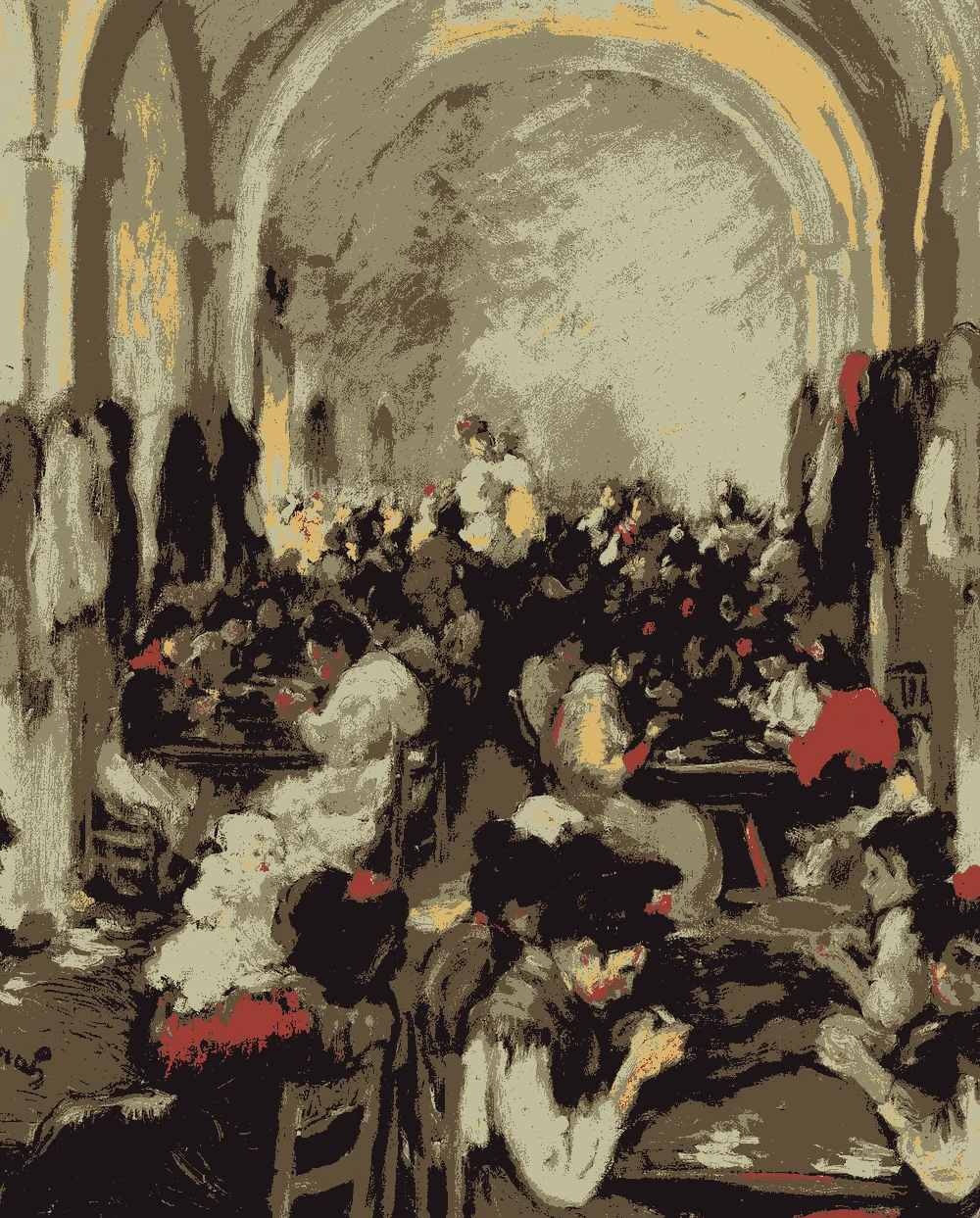
Cigar Making in Seville Color Palette & Paint Colors
This palette pairs dusty olive and pale straw with deep brown, near-black and one small note of brick red, all measured from a 1899 oil painting at The Art Institute of Chicago. It suits dens, dining rooms and studies where you want a warm, grounded feel without much brightness.
Quick answer
Use the pale straw (#C1BD99, LRV 50) on the walls, the olive (#918867) on an accent wall or built-ins, and the deep brown (#614F3A) on wood trim or furniture. Keep the golden yellow (#D9B56A) for lamps or art, and the brick red (#9C3C35) for pillows or a rug.
Ricard Canals y Llambí, Cigar Making in Seville, 1899.
The Art Institute of Chicago, open access.
The bar shows each color's measured share of the canvas.
The 6 colors in this painting
Measured from the image and ordered by how much of the canvas they cover. LRV is how much light a color reflects, from 0 for black to 100 for white.
Dusty Olive Khaki
#918867 · 27.1% · LRV 25
Deep Walnut Brown
#614F3A · 27% · LRV 8
Near-Black Plum
#1D1517 · 24.8% · LRV 1
Pale Straw Green
#C1BD99 · 16% · LRV 50
Soft Marigold Gold
#D9B56A · 3.5% · LRV 49
Brick Red Clay
#9C3C35 · 1.6% · LRV 11
Where each color lives in the painting
Left, every pixel of the canvas snapped to its nearest palette color. Right, the detail where each color is strongest.
The nearest color from each brand. “Near-identical” and “Very close” are hard to tell apart on a wall; with “Similar”, compare a sample with the painting. Brands with nothing close are left out.
Paint names belong to their brands. Matches are measured from screen colors and are approximate; Light & Pigment is not affiliated with any paint brand.
How pale straw green looks in your light
The wall color shifted for the light it will live in. Check the version closest to your room before buying a sample.
North-facing room#B3B4A2
The pale straw wall (#C1BD99, LRV 50) can look a little flatter and greener in cool north light, since it has less sun to warm it. Pair it with the golden yellow in lamps or fabric to keep the room from feeling gray.
South-facing room#CFC6A1
In strong south light, the straw wall will read lighter and creamier, and its warm yellow undertone will come forward. Because its LRV is only 50, it should stay soft rather than glare, though you may want to test a large sample first.
Evening, warm lamps (2700K)#AF9D75
Warm evening bulbs will push the straw toward yellow and make the walls feel cozy and amber. The olive and brown accents will deepen, so choose bulbs that are not too orange if you want the walls to stay fresh.
Try the palette in a room
Pick which painting color goes on the walls, the big furniture and the bold piece. Floors, shadows and light follow your choices.
Wood takes Deep Walnut Brown and the rug border takes Brick Red Clay in every combination.
Mood board
Details from the painting next to the colors and materials that carry them into a room.
Pale Straw Green
Soft Marigold Gold
Dusty Olive Khaki
LinenOiled oakLime plasterAged brass
Save this palette
A card with the painting, all 6 colors and a room scheme. Pin it, or take it to the paint store.
Yes, but use it sparingly. At LRV 1 it absorbs almost all light, so it works best on a door, a picture frame or a single piece of furniture. In the painting it covers about a quarter of the canvas, but in a room a little goes a long way.
How much brick red should I add?
Very little. The red (#9C3C35, LRV 11) covers only 1.6% of the painting, so treat it as a small accent in pillows, a throw or a rug. One or two touches are enough to warm the scheme.
Which colors work for wood tones and trim?
The deep brown (#614F3A, LRV 8) is the match for wood. It suits a dark table, shelving or window trim against the straw walls. The contrast is strong, so it helps define edges in the room.
Image: The Art Institute of Chicago, Public domain (CC0).
Palette, posterized image, details and room views generated by Light & Pigment from that image.
Colors look different on screen than on a wall, so always test a sample.