North-facing room
#DCBEA9The pale peach wall (#FFCAA5, LRV 66) will look a little cooler and quieter in north light, so its warm undertone helps keep the room from feeling flat. Plan on it reading softer than the swatch.
Paint colors for your home, inside and out
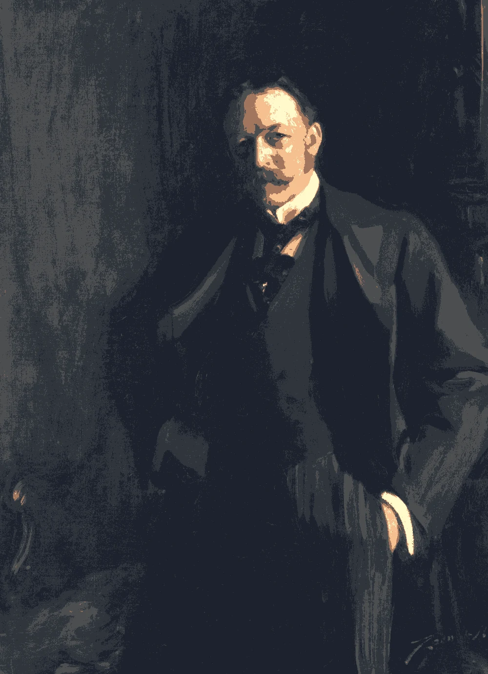
20th-century Italian painting · art-to-room palette
This palette pairs a deep brown and a smoky gray with a gray-green mid-tone, then warms it with terracotta and soft peach. It suits a calm, grown-up living room, study or bedroom where you want depth without a cold feel.
Quick answer
Use the pale peach (#FFCAA5) on the walls and the gray-green (#A2A79F) for main pieces like a sofa, curtains or built-ins. Keep the deep brown (#4B342F) for accents such as a door, a bookcase or a small table, and use the coral (#F99D81) in textiles.

Measured from the image and ordered by how much of the canvas they cover. LRV is how much light a color reflects, from 0 for black to 100 for white.
Left, every pixel of the canvas snapped to its nearest palette color. Right, the detail where each color is strongest.



The nearest color from each brand. “Near-identical” and “Very close” are hard to tell apart on a wall; with “Similar”, compare a sample with the painting. Brands with nothing close are left out.
| Painting color | Closest paints | LRV | Use it for |
|---|---|---|---|
Deep Cocoa Brown#4B342F |
|
4 | One bold piece |
Smoky Slate Gray#5F6463 |
|
12 | Small accents, art, accessories |
Soft Sage Gray#A2A79F |
|
38 | Bed, sofa, curtains |
Dusty Terracotta#B97F6A |
|
27 | Small accents, art, accessories |
Pale Peach Cream#FFCAA5 |
|
66 | Main walls |
Warm Coral Pink#F99D81 |
|
46 | One small textile |
Paint names belong to their brands. Matches are measured from screen colors and are approximate; Light & Pigment is not affiliated with any paint brand.
The wall color shifted for the light it will live in. Check the version closest to your room before buying a sample.
#DCBEA9The pale peach wall (#FFCAA5, LRV 66) will look a little cooler and quieter in north light, so its warm undertone helps keep the room from feeling flat. Plan on it reading softer than the swatch.
#FFD0ABIn strong south light the peach wall will glow and may read more pink or orange, especially near sunlit floors. Test a large sample and look at it at midday before you commit.
#D2A57BUnder warm evening bulbs the peach deepens and turns cozier, and the gray-green and slate pieces will pick up some warmth. Choose bulbs with a soft white tone so the walls do not tip too orange.
Pick which painting color goes on the walls, the big furniture and the bold piece. Floors, shadows and light follow your choices.
Wood takes a warm mid-brown and the rug border takes Warm Coral Pink in every combination.
Details from the painting next to the colors and materials that carry them into a room.

A card with the painting, all 6 colors and a room scheme. Pin it, or take it to the paint store.
You can, but at LRV 4 it absorbs almost all the light and will make a small or dim room feel closed in. It works best on a single wall in a large room, or on a door, shelving or trim as an accent.
The gray-green (#A2A79F, LRV 38) is the main color in this palette, so it suits a sofa or curtains well. Its green undertone sits comfortably against the warm peach and keeps the room from looking all pink.
Keep them to small touches. The coral (#F99D81) works in pillows, a throw or a rug, and the terracotta (#B97F6A) in a vase, a chair or a framed print. Together they should cover only a small part of the room.
Image: The Art Institute of Chicago, Public domain (CC0). Palette, posterized image, details and room views generated by Light & Pigment from that image. Colors look different on screen than on a wall, so always test a sample.