Modern Kitchen Colors: A Palette Measured from Paintings
A modern kitchen palette works best with a pale, quiet wall color and a few deep tones for cabinets and accents. These six colors were measured from paintings at The Art Institute of Chicago. Each one lists its light reflectance value (LRV) and the closest commercial paints.
Quick answer
Use the pale gray #DAE0E5 on walls, the blue #657E8D or the charcoal #5F6463 on cabinets or an island, and keep the near-black #2E261D for one small bold piece.
Every color on this page was measured from one of these public-domain paintings.
The palette
#DAE0E5LRV 74
Pale Cool Gray
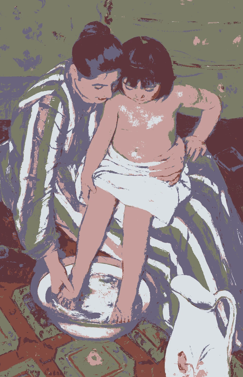
Use it on kitchen walls and the ceiling. Its LRV of 74 bounces light around, and with no clear undertone it stays calm beside cabinets and counters. Measured from Mary Cassatt's "The Child's Bath" (1893).
Choose it for walls or upper cabinets when you want more color than a pale gray. Its LRV of 49 sits in the middle, and the green undertone suits wood and plants. Measured from James McNeill Whistler's "Nocturne: Blue and Gold—Southampton Water" (1872).
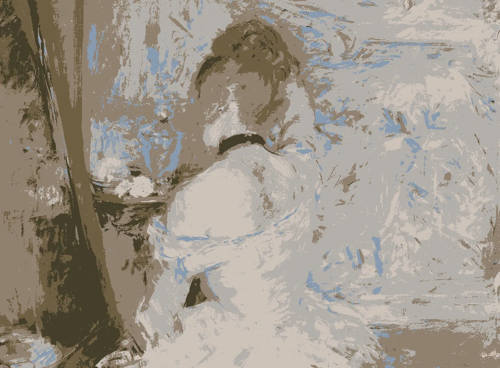
Good for textiles, a painted pantry door or walls in a kitchen that gets cool light. The warm yellow undertone softens gray and blue neighbors, and the LRV of 56 keeps it light. Measured from Berthe Morisot's "Woman at Her Toilette" (1875–80).
Keep it for one bold piece such as stools, a range hood or open shelving. At LRV 2 it reads nearly black, with a warm yellow undertone that pairs well with wood. Measured from Charles Gifford Dyer's "Seventeenth-Century Interior" (1877).
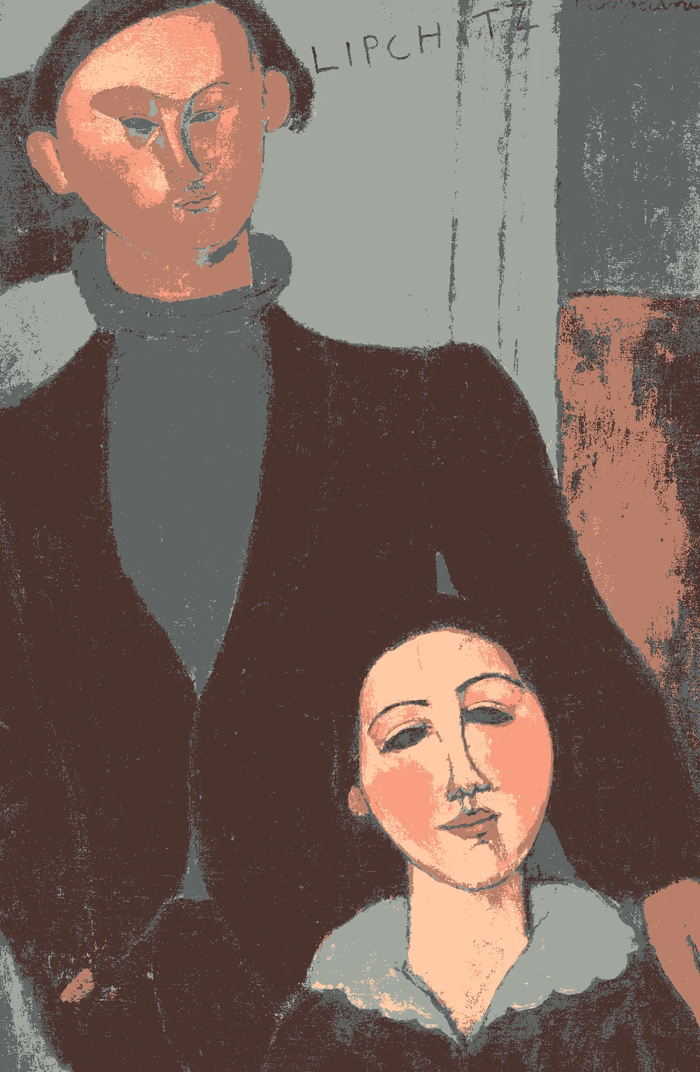
Use it on a full run of lower cabinets or an island. At LRV 13 it reads deep, and with no clear undertone it works with both warm and cool surfaces. Measured from Amedeo Modigliani's "Jacques and Berthe Lipchitz" (1916).
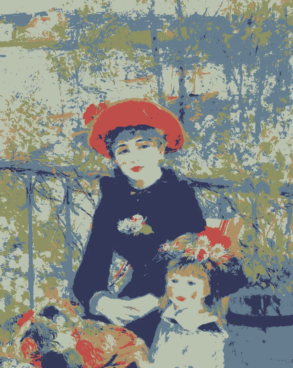
A good choice for main furniture such as a island, a hutch or lower cabinets. The cool blue undertone and LRV of 20 give depth without going black. Measured from Pierre-Auguste Renoir's "Two Sisters (On the Terrace)" (1881).
The same paint reads differently in cool north light, warm south sun and under evening lamps. Find the column closest to your room.
Color
Neutral daylight
North light
South light
Evening lamps
Pale Cool Gray
Soft Green Gray
Warm Greige
Try these colors in a room
Pick which color goes on the walls, the big furniture and the bold piece. Floors, shadows and trim follow your choice.
The framed picture on the wall is The Child's Bath.
How do I choose between these modern kitchen colors?
Start with the walls. The palest color, #DAE0E5, has an LRV of 74, so it reflects light and suits most kitchens. It has no clear undertone, which keeps it calm next to cabinets and counters. If you want walls with more body, look at #B7BCB1 (LRV 49, green undertone) or #CDC3B8 (LRV 56, warm yellow undertone).
Then pick one deeper color for the cabinets or an island. #657E8D (LRV 20) is a mid-tone blue that works well on lower cabinets. #5F6463 (LRV 13) is deeper and neutral, a good fit for a full run of cabinets. Save #2E261D (LRV 2) for a small bold piece, since it reads almost black.
A simple rule keeps the palette modern: one light color, one deep color and one accent. Add wood and a textile in the remaining tones, and stop there.
What goes with these colors: trim, ceiling and flooring?
For the ceiling, use the lightest color in the palette. #DAE0E5 has an LRV of 74, so it sends light back down into the room. Painting the trim the same color as the walls gives a clean, quiet look. If you want trim to show, a deeper tone such as #5F6463 draws a clear line around windows and doors.
For flooring and wood, a warm mid-brown such as #8B6B4A sits well against the cool blue and gray. It warms the palette without competing with it. If your floor is already dark, keep the walls light so the room does not feel closed in.
Use #CDC3B8 for soft items: a shade, a runner, seat cushions or a dish towel. Its warm yellow undertone ties the wood to the cooler paint colors. Put #2E261D in a single spot, such as stool legs or a hood, so it reads as a deliberate accent.
How do these colors behave in kitchen light?
Light changes every color on this page. In a kitchen with north-facing windows, the light is cooler and grays can lean bluer. #DAE0E5 may feel cool there, so #CDC3B8 and its warm yellow undertone can balance it. In a south-facing kitchen, warmer light is easier on the cool blue #657E8D.
Bulbs matter too. Warm bulbs pull colors toward yellow, and cool bulbs can flatten them. The green in #B7BCB1 may show more under some bulbs, so check it in the evening as well as by day.
Colors below about 20 LRV absorb light. #2E261D, #5F6463 and #657E8D are all in that range. Use them where you have good task lighting, such as under-cabinet lights, and balance them with a light wall and ceiling. In a small kitchen, limit them to one element so the room still feels open.
How should I test these colors before painting?
Paint large samples, at least two feet square, on poster board or directly on the wall. Small chips hide how a color really looks. Move the board around the kitchen and view it in the morning, afternoon and evening. Hold it next to the counter, backsplash and floor, because neighbors change how a color reads.
The hex values here were measured from paintings, and screens vary, so treat them as a starting point. Use the closest paint match listed with each color and compare the chip to the surfaces in your room. Most matches are near-identical or very close, but check them in your own light.
There is no close commercial match for #2E261D. Take a dark brown chip to a paint counter, compare it to this color and ask for a custom match if needed. Leave samples up for a few days before you decide.
FAQ
What are good modern kitchen color combinations?
Try pale gray #DAE0E5 on the walls, charcoal #5F6463 or blue #657E8D on the cabinets, and #2E261D as a small accent. Add warm wood and a greige textile in #CDC3B8.
Which colors work for contemporary kitchen color schemes with cabinets?
#657E8D (LRV 20) and #5F6463 (LRV 13) both suit lower cabinets. Keep the walls and ceiling light so the deeper cabinets do not make the room feel heavy.
Can I use dark colors in a small modern kitchen?
Yes, in small amounts. Colors with an LRV of 13 or 2 absorb light, so use them on one element such as an island or a hood. Keep the walls light and add good task lighting.
Which paints match this modern kitchen color palette?
The closest matches measured include Sherwin-Williams SW 6238 Icicle for #DAE0E5 and SW 2848 Roycroft Pewter for #5F6463. Behr and Farrow & Ball matches are listed for most colors, and #2E261D has no close match.
How many colors should a modern kitchen color palette have?
Three main colors are enough: one light, one deep and one accent. Wood and one textile tone can sit alongside them without crowding the palette.
Save these colors
A card with every color on this page, its LRV and the paintings it comes from. Pin it, or take it to the paint store.
Painting images: The Art Institute of Chicago, public domain (CC0).
Colors measured by Light & Pigment. Paint names belong to their brands and matches are approximate. Colors look different on screen than on a wall, so always test a sample.


 From The Child's Bath, Mary Cassatt