Hygge Color Scheme: Six Calm Colors from Paintings
A hygge color scheme is soft, quiet and easy to live in. These six shades are measured from museum paintings and include light walls, muted blues and a deep olive.
Quick answer
Use #DDDED8 on the walls, #A1A9AE for main furniture, and #807A5F or #798F9B for a bold piece or textile.
A very dark neutral with an LRV of 1, best for frames, lamp bases and thin details. It comes from Carolus-Duran's portrait of Henri Fantin-Latour, 1861.
The same paint reads differently in cool north light, warm south sun and under evening lamps. Find the column closest to your room.
Color
Neutral daylight
North light
South light
Evening lamps
Soft Gray White
Morning Fog Blue
Stone Walkway Beige
Bracing Slate Blue
Try these colors in a room
Pick which color goes on the walls, the big furniture and the bold piece. Floors, shadows and trim follow your choice.
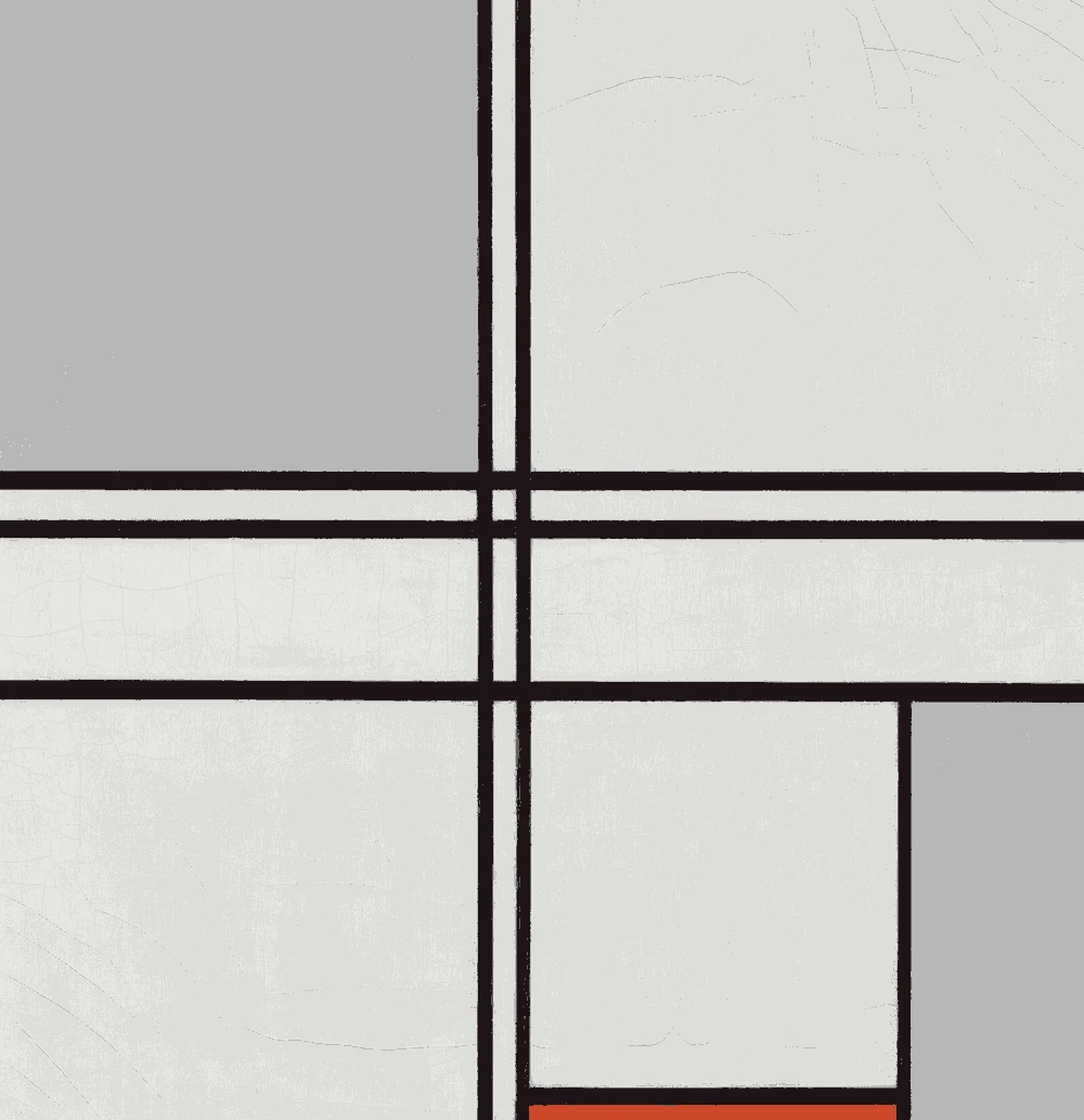
The framed picture on the wall is Composition (No. 1) Gray-Red.
How do you build a hygge color palette?
Begin with a light, quiet base. The gray white #DDDED8 has an LRV of 73 and a neutral undertone, so it feels calm without turning cold. Use it on walls and the ceiling to keep the room bright through long winters.
Then add one cool blue. The fog blue #A1A9AE is light enough for a sofa or a bedroom wall, while the deeper slate #798F9B has an LRV of 26 and works better on cushions and a single feature wall.
Finally, bring in warmth with the beige #B6AF9F and the olive #807A5F. These two have a warm yellow undertone, and they stop the blues from feeling too cool. Keep the black #0F0F0E to small pieces. In a hygge room, contrast comes from candlelight and texture more than from strong color.
What trim, ceiling and flooring suit this scheme?
Keep the ceiling and trim the same as the walls, or one step lighter. The gray white #DDDED8 in a matte finish on the ceiling and a satin on the trim gives a soft, continuous look. Avoid a stark white, which will make the beige and olive look muddy.
For flooring, the suggested wood tone is #8B6B4A. Medium oak or walnut works well, and a pale wood floor suits the fog blue. If you have a gray floor, add the beige #B6AF9F in a rug so the room does not feel cold.
Wool, sheepskin, linen and knit throws do much of the work here. Choose them in the beige, olive or slate so the textures stay inside the palette and the room looks calm instead of busy.
How do these colors look in different light?
In north light the blues look cooler and the fog blue #A1A9AE can feel gray. If your room faces north, balance it with the beige #B6AF9F and warm bulbs. Its LRV of 43 means it still reflects a fair amount of light.
In south light the gray white looks clean and soft, and the slate blue #798F9B reads as a deeper, richer blue. This makes it a good wall color in a bright living room.
Under warm evening bulbs the olive #807A5F comes forward and the blues turn quieter. That is useful for a hygge room, where most of the use is in the evening. Choose bulbs of a warm white and use several low lamps instead of one overhead light.
How should you test hygge paint samples?
Paint a large sample of each wall color and tape it up for at least two days. Look at it in the morning, at noon and in the evening with the lamps on. Hygge rooms are mostly used at night, so the evening view matters most.
Place the samples beside your sofa, curtains and floor. The gray white and the fog blue are close in value, with LRVs of 73 and 39, but they feel different next to wood. Seeing them together will show which one your furniture needs.
Use the closest paint matches as a starting point. Each color lists matches that were measured as near-identical or very close, but sheen and lighting still change how they look. Get a sample pot of two options and compare them directly before you buy more.
FAQ
What colors are in a hygge color palette?
A hygge palette uses soft whites, muted blues, warm beiges and an earthy olive. This page lists six such colors, each measured from a museum painting.
Is a hygge color scheme the same as a Scandinavian palette?
They overlap. This page uses colors from the Scandinavian interior style, so the same shades work for either search.
Which hygge color is best for a bedroom?
The fog blue #A1A9AE is calm and light enough for walls. Add the beige #B6AF9F in bedding to keep the room warm.
Can I use black in a hygge room?
Yes, in small amounts. The black #0F0F0E has an LRV of 1, so use it for a frame or a lamp base instead of a wall.
What accent color goes with a hygge palette?
The olive #807A5F adds a warm, natural note. It works in a chair, a throw or a plant pot without breaking the calm.
Save these colors
A card with every color on this page, its LRV and the paintings it comes from. Pin it, or take it to the paint store.
Painting images: The Art Institute of Chicago, The Metropolitan Museum of Art, public domain (CC0).
Colors measured by Light & Pigment. Paint names belong to their brands and matches are approximate. Colors look different on screen than on a wall, so always test a sample.


 From Composition (No. 1) Gray-Red, Piet Mondrian