A city loft color palette is a contrast of soft near-blacks and a warm cream, with one bright accent. These six colors define the Industrial style, and each was measured from a painting.
Quick answer
Use the warm cream #ECE2C0 on the walls and the taupe #D0C3BA on the main furniture. Add the dark brown #5F4C2A as wood, the orange #D7714A as the bold piece and #302F2B for textiles or metal.
Every color on this page was measured from one of these public-domain paintings.
The palette
#302F2BLRV 3
Cast Iron Black
A very dark neutral with an LRV of 3, good for steel window frames, shelving or a kitchen island. It comes from William Michael Harnett's For Sunday's Dinner, and Sherwin-Williams SW 6258 Tricorn Black is a very close match.
An almost pure black with an LRV of 0 and no close commercial paint. Use it for thin details such as frames and hardware. It was measured from Rembrandt's Portrait of a Man.
Sherwin-Williams SW 6258 Tricorn Black
Nearest available
#5F4C2ALRV 8
Dark Rust Olive
A deep color with a warm yellow undertone and an LRV of 8, close to an aged leather or wood tone. It comes from Charles Cottet's Portrait of a Woman, and Sherwin-Williams SW 9125 Oliva Oscuro is a very close match.
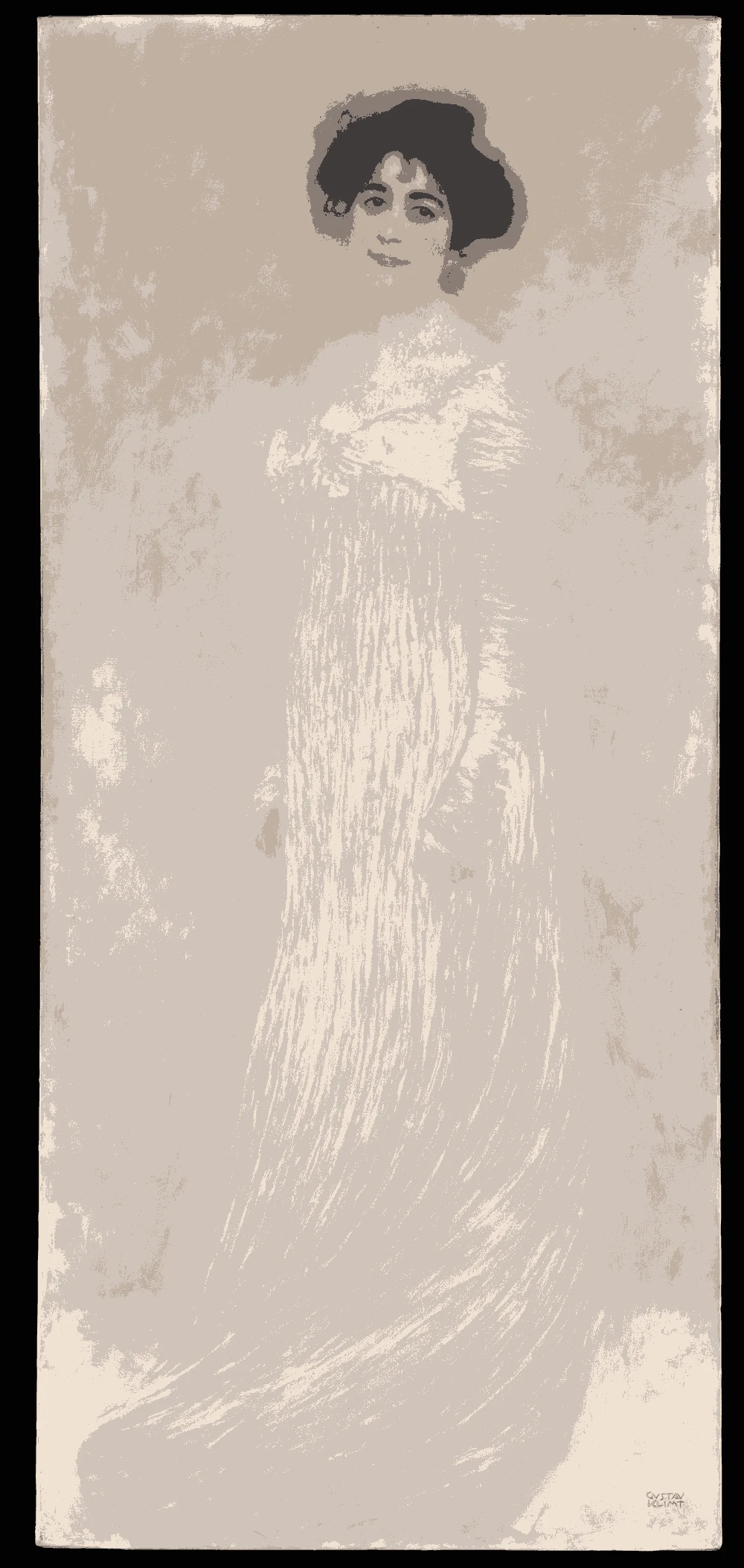
A light color with a warm red-orange undertone and an LRV of 56, suited to a sofa, a rug or a second wall. It was measured from Gustav Klimt's Serena Pulitzer Lederer, and Sherwin-Williams SW 6036 Angora is a near-identical match.
A mid-tone with a warm red-orange undertone and an LRV of 27. Use it for one chair, a door or a piece of art. It comes from Wilhelm Tischbein's Paris, and Sherwin-Williams SW 6885 Knockout Orange is a very close match.
A very light color with a warm yellow undertone and an LRV of 76, the best wall color for brick-and-steel lofts that need to reflect light. It was measured from a Mughal Portrait of a Beauty, and Sherwin-Williams SW 6693 Lily is a near-identical match.
The same paint reads differently in cool north light, warm south sun and under evening lamps. Find the column closest to your room.
Color
Neutral daylight
North light
South light
Evening lamps
Concrete Taupe
Burnt Orange
Plaster Cream
Try these colors in a room
Pick which color goes on the walls, the big furniture and the bold piece. Floors, shadows and trim follow your choice.
The framed picture on the wall is For Sunday's Dinner.
How do you build a city loft color palette?
A loft already has strong materials, such as brick, steel and concrete, so paint should be quiet. Start with the plaster cream #ECE2C0 at LRV 76 on the walls. It reflects light from tall windows and softens raw surfaces.
Add the concrete taupe #D0C3BA for large furniture. It is lighter than most concrete grays but has a similar calm.
Then use black in thin lines. The cast iron black #302F2B and the true black #0E0E0C suit window frames, shelves and lamps. Choose one orange item, the burnt orange #D7714A, so the room has a focal point. Too many accents will fight with the building itself.
What should you pair with these colors: trim, ceiling and floor?
In a loft, the ceiling is often exposed or very high. If you paint it, the cream is a good choice because it lifts the room without a stark white. A darker ceiling can work if the ceiling is high and the windows are large.
For trim, use the wall color or the cast iron black. Black trim looks sharp against cream walls, and it matches steel windows.
For floors, concrete, polished wood and dark oak all work. The suggested wood tone is #5F4C2A, a deep warm brown. A rug in the taupe softens a hard floor.
Leather in the dark rust olive adds warmth. Keep metal finishes consistent, either black or brushed steel, rather than mixing several.
How do loft colors behave in the light?
Lofts usually have large windows, so daylight matters. In north light the cream looks a little cooler and the taupe more gray. In south or west light the cream turns bright and the orange gets stronger.
At night, warm bulbs make the cream golden and the black tones merge into shadows. If the room has high ceilings, use lamps at several heights so the dark colors do not disappear.
Very dark colors such as #0E0E0C at LRV 0 absorb nearly all light, so use them where you want a sharp line, not where you need brightness. The orange is stable in most light, but under very warm bulbs it moves toward red.
How do you test a loft palette?
Paint large samples on the wall that gets the most light and on the one that gets the least. Compare the cream and the taupe side by side, because they can look similar in photographs but differ on the wall.
Hold the orange sample next to your furniture and the brick. Brick has its own orange and red tones, and a second orange can clash.
Check the samples in the morning and in the evening. If the cream feels too yellow against the brick, try a lighter option. The paint matches here are the closest measured ones, so use them to find a brand color, and confirm with a real sample.
FAQ
What colors suit a city loft?
Warm cream, taupe, near-black and one accent such as burnt orange. This palette uses #ECE2C0, #D0C3BA, #302F2B and #D7714A.
Should a loft be painted dark?
Only if there is plenty of daylight. Colors such as #302F2B at LRV 3 take up light, so use them on frames or one wall.
What color goes with exposed brick?
A warm cream or taupe sits well with brick. Use black details to match steel.
Is orange a good accent in an industrial room?
Yes, as one item. The #D7714A at LRV 27 works as a chair, door or artwork.
What wall finish suits an industrial style?
A flat or matte finish suits plaster-like walls and avoids glare from big windows.
Save these colors
A card with every color on this page, its LRV and the paintings it comes from. Pin it, or take it to the paint store.
Painting images: The Art Institute of Chicago, The Metropolitan Museum of Art, public domain (CC0).
Colors measured by Light & Pigment. Paint names belong to their brands and matches are approximate. Colors look different on screen than on a wall, so always test a sample.


 From For Sunday's Dinner, William Michael Harnett