Farmhouse Kitchen Color Palette from Six Paintings
A farmhouse kitchen needs soft, lived-in color that works with wood and white. These six shades were measured from museum paintings, and each comes with its LRV and closest paint matches.
Quick answer
Paint the walls #DDDED8, bring in the greige #D1C0B5 on islands or furniture, and keep #D8D6BA for a bold piece and #3B2F1D for textiles.
Sherwin-Williams SW 7666 Fleur de Sel
Near-identical
Behr N200-1 Moth Gray
Near-identical
Valspar 7006-18 Blizzard Fog
Near-identical
Farrow & Ball No. 277 Dimpse
Very close
#D8D6BALRV 66
Pale Cucumber Cream
A very light color with a green undertone and an LRV of 66, suited to a pantry door or a painted island. It comes from Edward Henry Potthast's A Holiday, c. 1915.
A very dark warm yellow brown with an LRV of 3, useful on a beam, a stool or a rug. It comes from Alexandre-Gabriel Decamps's The Turkish Patrol, ca. 1855-56.
The same paint reads differently in cool north light, warm south sun and under evening lamps. Find the column closest to your room.
Color
Neutral daylight
North light
South light
Evening lamps
Fleur Gray White
Pale Cucumber Cream
Elephant Greige
Escape Sage Gray
Try these colors in a room
Pick which color goes on the walls, the big furniture and the bold piece. Floors, shadows and trim follow your choice.
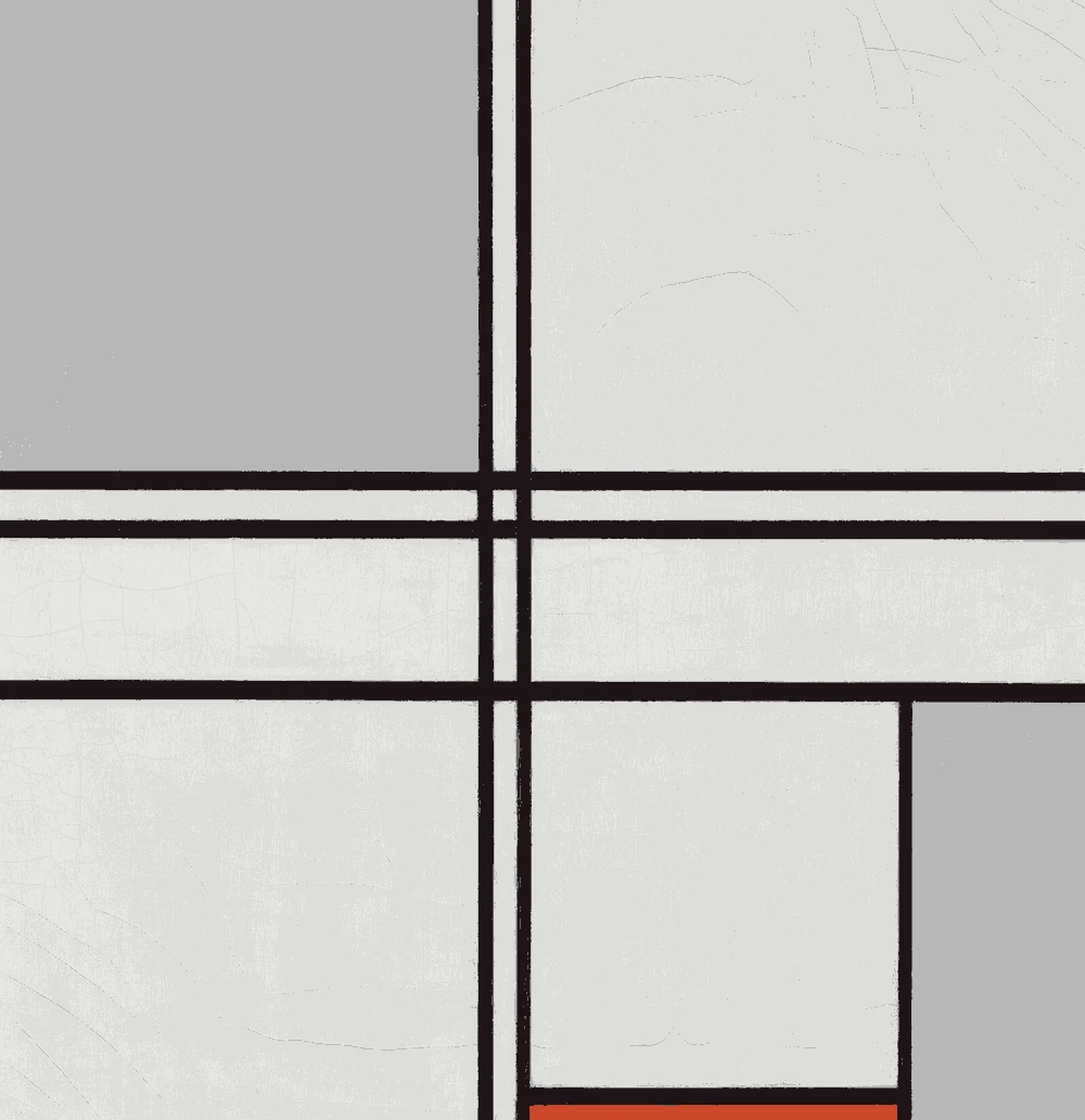
The framed picture on the wall is Composition (No. 1) Gray-Red.
How do you choose between these farmhouse kitchen colors?
Start with the walls. The gray white #DDDED8 has an LRV of 73 and no clear undertone, so it works with almost any cabinet. It is the safest base for a farmhouse kitchen.
Next, choose one supporting color. The greige #D1C0B5 suits a kitchen with oak cabinets because its warm red-orange undertone matches the wood. The cucumber cream #D8D6BA has a green undertone and suits white cabinets, where it adds a little life without getting loud.
Use the darks sparingly. The two very dark colors have LRVs of 1 and 3, so they read as near-black. They belong on small items, such as pulls, lights and stools. A kitchen where more than a tenth of the surface is that dark will feel smaller.
What goes with these colors: trim, ceiling and floors?
For trim and ceiling, stay within the same family. Use #DDDED8 on the ceiling and trim for a calm, continuous look, or choose a slightly brighter white for crisp edges. Do not choose a very blue white, because the warm greige and cucumber cream will look dingy beside it.
For floors, the suggested wood tone is #8B6B4A, a mid-brown. It works with every color on this page. If your floor is pale oak, the sage gray #ABADA2 on lower cabinets gives a clear step in tone. If your floor is dark, keep the walls at the light end of this palette so the room does not feel heavy.
For the textile, the dark umber #3B2F1D suits a rug runner or a dish towel stripe. A single dark piece repeated two or three times looks planned.
How do these colors behave in kitchen light?
Kitchens often have both a window and strong task lighting, so test in both. In north light the gray white can look slightly cool. If so, move toward the greige #D1C0B5 on the walls, since its LRV of 55 still reflects a good share of the light.
In a bright south kitchen the cucumber cream #D8D6BA looks softer and more neutral, and its green undertone becomes mild. Under warm evening bulbs it turns more yellow, so check it at night before choosing it for a large wall.
The sage gray #ABADA2 has an LRV of 41. That makes it a mid-light color, and it can look darker in a room with little daylight. Lower cabinets in this color are a good use, because they sit in shadow anyway and the shade will look consistent across the day.
How do you test farmhouse kitchen paint samples?
Paint a sample board at least two feet square, with two coats, and tape it next to the cabinets, the backsplash and the floor. Kitchens have many fixed materials, so a color that looks right alone can change beside tile or a countertop.
Move the board around the room. Look at it by the window in the morning, near the stove at noon and under your evening lights. Check it again on a cloudy day.
Compare the closest paint matches to the sample, not just the hex. The matches listed with each color were measured as the nearest, and a small change in the sheen or the room light can shift how they look. Choose a washable eggshell or satin for kitchen walls, and live with the sample for two days before you buy gallons.
FAQ
What colors suit a farmhouse kitchen with white cabinets?
Use the pale cucumber cream #D8D6BA or the sage gray #ABADA2 on the walls. Both have a gentle green undertone that sits well beside white.
What paint colors go with oak cabinets in a farmhouse kitchen?
The greige #D1C0B5 has a warm red-orange undertone that echoes oak. The gray white #DDDED8 also works as a calm wall color.
Is a dark color too heavy for a farmhouse kitchen?
Not in small amounts. The two darks have LRVs of 1 and 3, so use them on hardware, a range hood or stools instead of walls.
What is the best wall color for a farmhouse kitchen palette?
The gray white #DDDED8, with an LRV of 73, is the most flexible base. It reflects light and does not push the room toward one undertone.
How many colors should I use in the kitchen?
Use three to four: one base for walls, one for cabinets or an island, one wood tone and one dark accent. The rest of the palette is for choosing between options.
Save these colors
A card with every color on this page, its LRV and the paintings it comes from. Pin it, or take it to the paint store.
Painting images: The Art Institute of Chicago, The Metropolitan Museum of Art, public domain (CC0).
Colors measured by Light & Pigment. Paint names belong to their brands and matches are approximate. Colors look different on screen than on a wall, so always test a sample.


 From Composition (No. 1) Gray-Red, Piet Mondrian