North-facing room
#CCBEA7North light is cool and even, so the warm cream wall can look a little greyer than the swatch. The yellow undertone helps it stay soft and inviting.
Paint colors for your home, inside and out
20th-century French painting · art-to-room palette
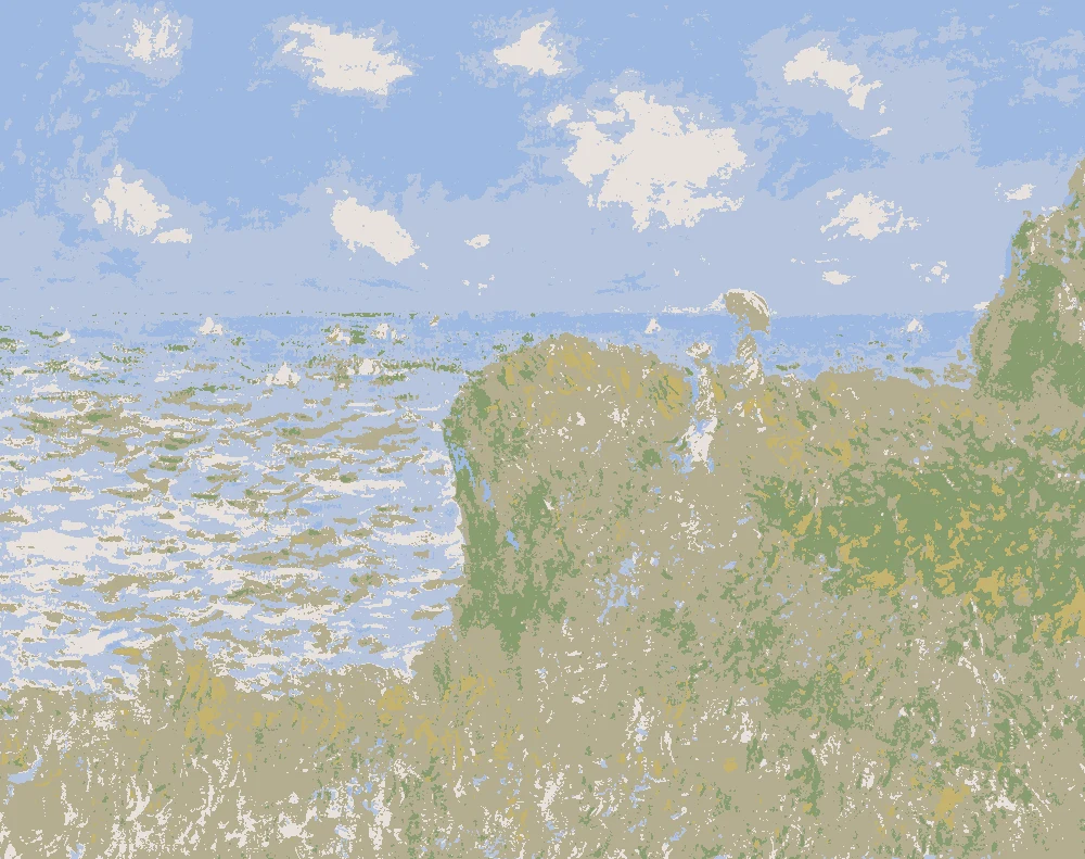
This palette comes from Claude Monet's 1901 painting Vétheuil, held at The Art Institute of Chicago. Its dusty violet greys and warm creams suit living rooms, bedrooms and dining rooms where a quiet, softly colored backdrop is wanted.
Quick answer
Use the soft warm cream on the walls and the dusty violet grey on one larger feature wall or a sofa. Keep the muted ochre for small accents such as a lamp base or cushion, and use the olive mustard gold on a textile like a throw or curtain.

Measured from the image and ordered by how much of the canvas they cover. LRV is how much light a color reflects, from 0 for black to 100 for white.
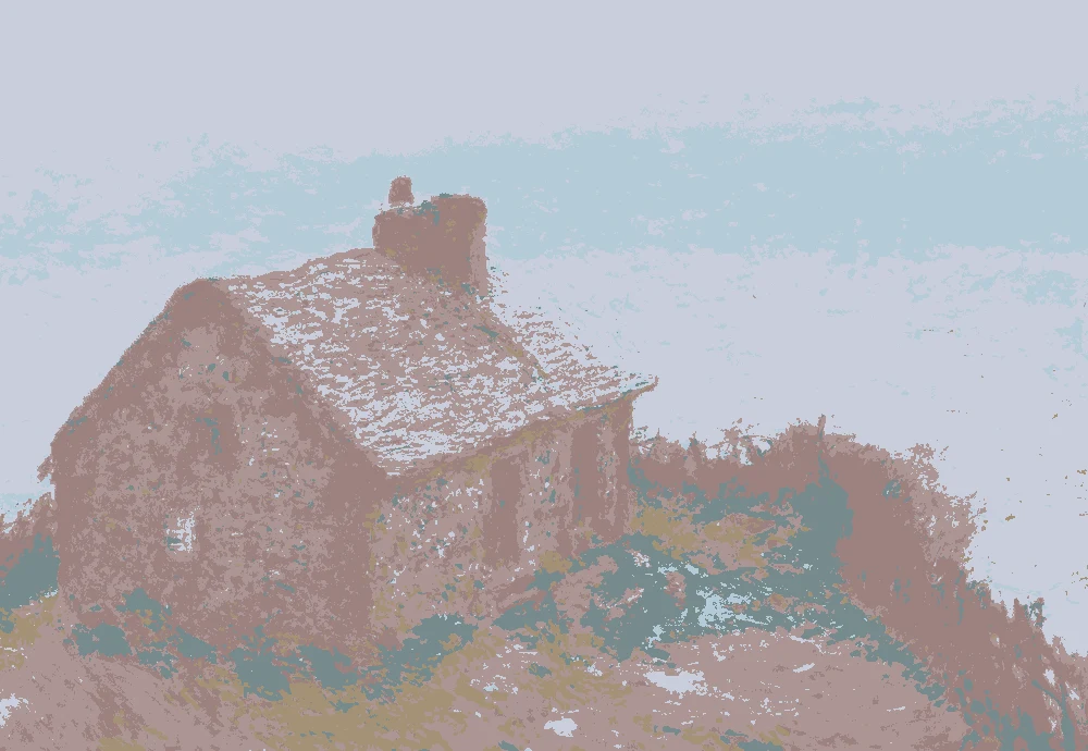
Left, every pixel of the canvas snapped to its nearest palette color. Right, the detail where each color is strongest.


The nearest color from each brand. “Near-identical” and “Very close” are hard to tell apart on a wall; with “Similar”, compare a sample with the painting. Brands with nothing close are left out.
| Painting color | Closest paints | LRV | Use it for |
|---|---|---|---|
Dusty lilac grey#B2A3B1 |
|
39 | Bed, sofa, curtains |
Muted ochre brown#A0905E |
|
28 | One bold piece |
Soft warm cream#E7CCA1 |
|
63 | Main walls |
Warm clay rose#C98C74 |
|
32 | Small accents, art, accessories |
Greyed lavender mauve#A69AB0 |
|
34 | Small accents, art, accessories |
Olive mustard gold#B2A052 |
|
35 | One small textile |
Paint names belong to their brands. Matches are measured from screen colors and are approximate; Light & Pigment is not affiliated with any paint brand.
The wall color shifted for the light it will live in. Check the version closest to your room before buying a sample.
#CCBEA7North light is cool and even, so the warm cream wall can look a little greyer than the swatch. The yellow undertone helps it stay soft and inviting.
#ECD2A8Strong south light brings out the warmth in the cream and can make it look pale or bright. The violet grey will look lighter and more open in this light.
#C5A67AWarm evening bulbs push the yellow undertone forward, so the cream glows and the violet grey looks softer and slightly deeper. The olive gold will look richer.
Pick which painting color goes on the walls, the big furniture and the bold piece. Floors, shadows and light follow your choices.
Wood takes a warm mid-brown and the rug border takes Olive mustard gold in every combination.
Details from the painting next to the colors and materials that carry them into a room.

A card with the painting, all 6 colors and a room scheme. Pin it, or take it to the paint store.
Use the soft warm cream on the walls. Its light reflectance value is 63, so it reads light and bounces light around the room. Keep the darker tones for furniture, textiles and accents.
You can, but the dusty violet grey has a light reflectance value of 39, so it reads mid-tone and can feel closed in a small or dark room. Try it on one wall first and check it at different times of day.
Let the cream wall carry the warm yellow tones and use the violet grey in fewer, larger areas. Repeat the olive gold once or twice, such as on a cushion, so the eye moves across the room.
Image: The Art Institute of Chicago, Public domain (CC0). Palette, posterized image, details and room views generated by Light & Pigment from that image. Colors look different on screen than on a wall, so always test a sample.
20th-century French painting · art-to-room palette
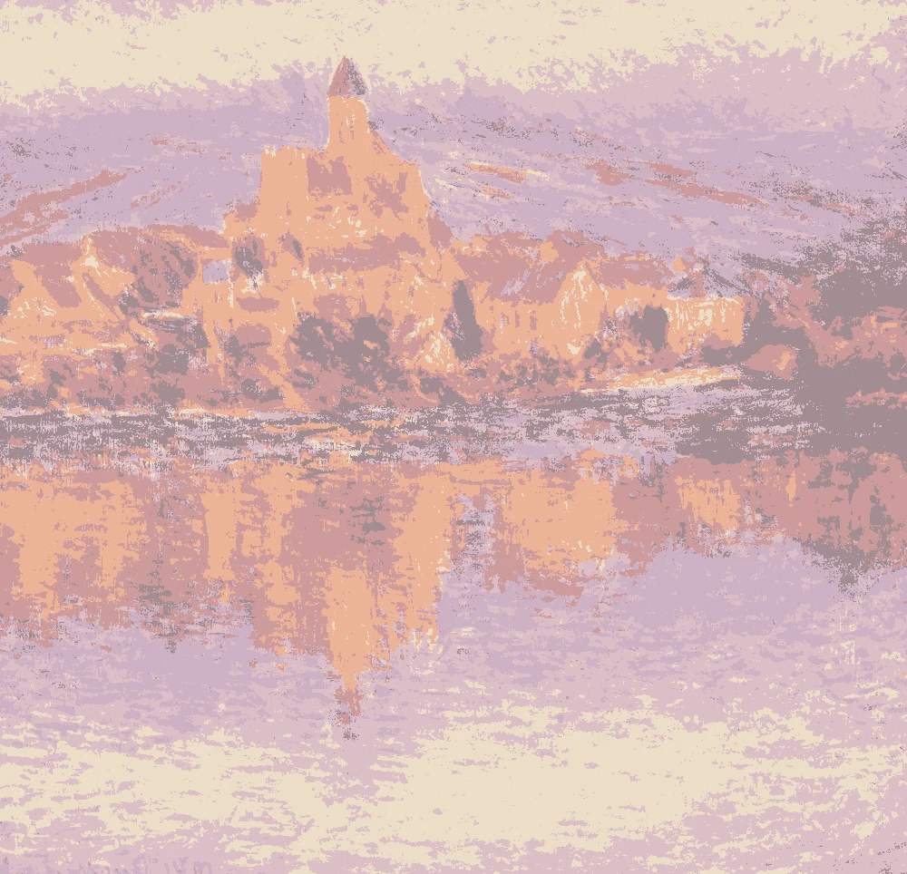
This palette comes from Claude Monet's 1901 painting Vétheuil, held at The Art Institute of Chicago. Its soft pinks, creamy white and peachy warm tones suit bedrooms, dining rooms and sitting rooms that need a gentle, airy feel.
Quick answer
Use the warm cream #ECDEC8 on most walls as the base. Put the soft rose blush #DBBFC7 on one main wall or in large pieces, use the light apricot #ECB397 in textiles, and keep the muted taupe #A28D91 for trim, a door or a single accent piece.

Measured from the image and ordered by how much of the canvas they cover. LRV is how much light a color reflects, from 0 for black to 100 for white.
Left, every pixel of the canvas snapped to its nearest palette color. Right, the detail where each color is strongest.


The nearest color from each brand. “Near-identical” and “Very close” are hard to tell apart on a wall; with “Similar”, compare a sample with the painting. Brands with nothing close are left out.
| Painting color | Closest paints | LRV | Use it for |
|---|---|---|---|
soft rose blush#DBBFC7 |
|
56 | Bed, sofa, curtains |
warm cream ivory#ECDEC8 |
|
74 | Main walls |
pale lilac mauve#CDB0C3 |
|
48 | Small accents, art, accessories |
dusty rose clay#CE9A9C |
|
39 | Small accents, art, accessories |
light apricot peach#ECB397 |
|
52 | One small textile |
muted mauve taupe#A28D91 |
|
29 | One bold piece |
Paint names belong to their brands. Matches are measured from screen colors and are approximate; Light & Pigment is not affiliated with any paint brand.
The wall color shifted for the light it will live in. Check the version closest to your room before buying a sample.
#D0CAC0In north light, the cream wall #ECDEC8 looks softer and a little cooler, so it stays calm without turning gray. Its warm yellow undertone helps keep the room from feeling flat.
#F0E0C6In strong south light, the cream wall #ECDEC8 can look bright and warm, and it may wash out the pink tones nearby. Test a sample on the wall at midday before you commit.
#C7B090Under warm evening bulbs, the cream wall #ECDEC8 takes on a golden glow and the pinks in the room look richer. Keep lamps warm so the palette stays balanced.
Pick which painting color goes on the walls, the big furniture and the bold piece. Floors, shadows and light follow your choices.
Wood takes a warm mid-brown and the rug border takes light apricot peach in every combination.
Details from the painting next to the colors and materials that carry them into a room.

A card with the painting, all 6 colors and a room scheme. Pin it, or take it to the paint store.
 Pink Color Combinations for House Exterior Painting
Blush Pink Bedroom Paint: Three Dusty Rose Shades to Compare
Pink Bathroom Paint Colors Measured From Paintings
 Cottage Color Scheme: Six Colors Measured From Paintings
Blush Paint: Shades of Pink for Interior Walls
East Facing Room Paint Color: Soft Neutrals for Morning and Afternoon
Use the warm cream #ECDEC8 for the largest area. It has an LRV of 74, so it reads light and bounces light around the room. The blush #DBBFC7 works well as a second, larger color on one wall.
Yes, but keep the walls to the lighter tones such as the cream #ECDEC8 and the blush #DBBFC7. Save the darker mauve taupe #A28D91, which has an LRV of 29, for small accents so the room does not close in.
Pair the light apricot #ECB397 with the cream walls for textiles such as cushions, curtains or a throw. Use the muted mauve taupe #A28D91 for a door, trim or one piece of furniture to anchor the scheme.
Image: The Art Institute of Chicago, Public domain (CC0). Palette, posterized image, details and room views generated by Light & Pigment from that image. Colors look different on screen than on a wall, so always test a sample.