Cottage Color Scheme: Six Colors Measured From Paintings
A cottage color scheme starts with a warm, light white and adds soft pink, sage, misty blue and straw gold. Each color here was measured from a painting, and each page entry gives its LRV and the closest paints.
Quick answer
Use the warm white #E6E2D0 on the walls, the misty blue #B5C5CC on main furniture, and keep the straw gold #C5B37A and sage green #96AA96 for a chair and textiles.
Every color on this page was measured from one of these public-domain paintings.
The palette
#E6E2D0LRV 76
Warm Cottage White
A very light white with a warm yellow undertone and an LRV of 76, so it bounces light around walls in small or dim rooms. Measured from Childe Hassam's "New England Headlands" (1899).
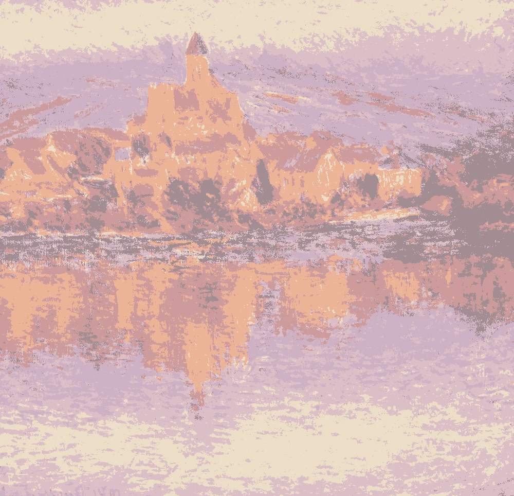
A light pink-red undertone with an LRV of 57, best for a bedroom wall, a lampshade or one accent piece. Measured from Claude Monet's "Vétheuil" (1901).
A light, grayed green with an LRV of 53 that works on cabinets, a dresser or a paneled wall. Measured from Vasily Kandinsky's "Painting with Green Center" (1913).
A light, cool blue with an LRV of 54, suited to main furniture, a kitchen island or built-ins. Measured from Childe Hassam's "New England Headlands" (1899).
A warm yellow at LRV 46, strong enough for a bold piece such as a chair, a frame or a door. Measured from Vasily Kandinsky's "Painting with Green Center" (1913).
The same paint reads differently in cool north light, warm south sun and under evening lamps. Find the column closest to your room.
Color
Neutral daylight
North light
South light
Evening lamps
Warm Cottage White
Dusty Rose Pink
Pale Sage Green
Misty Blue Gray
Muted Straw Gold
Soft Garden Green
Try these colors in a room
Pick which color goes on the walls, the big furniture and the bold piece. Floors, shadows and trim follow your choice.
The framed picture on the wall is New England Headlands.
How do I choose a cottage color scheme from these six colors?
Start with the wall. Cottage rooms usually want a soft base, so begin with #E6E2D0. At LRV 76 it reads light and bounces light, and its warm yellow undertone keeps a small room from feeling cold.
Then pick one supporting color for furniture or cabinets. The misty blue #B5C5CC (LRV 54) suits a dresser, a kitchen island or a built-in. The pale sage #BFC2AE (LRV 53) does the same job with a quieter, grayer feel. Choose one of them first, and only add the other once you have seen them together.
Keep the stronger colors small. The straw gold #C5B37A (LRV 46) works on a chair, a frame or a door. The mid-tone green #96AA96 (LRV 37) works best in curtains, cushions or a throw. The dusty rose #DBBFC7 (LRV 57) belongs on a bedroom wall or a single accent. A simple rule: one base, one furniture color, one or two accents.
What goes with a cottage palette: trim, ceiling and floors?
For the ceiling, stay close to the wall color. Using #E6E2D0 overhead and on the trim gives a soft edge with low contrast, which suits the gentle colors in this palette. If you want crisper trim, choose a white from the same warm family. A bright blue-white can look cold beside the yellow undertone.
Wood adds the darker note this palette lacks. A mid-brown such as #8B6B4A, on a floor, a beam or a table, grounds the pale colors. Its warmth sits well with the yellow in #E6E2D0 and #C5B37A, and it gives the green #96AA96 something to rest against.
For floors, natural or worn wood is the easiest match. Rugs and curtains are a good place to repeat the rose or the green. If you paint furniture in the misty blue, let the floor and the table stay wood so the room does not turn into one pale block.
How do these colors look in the light of my room?
Light changes these colors more than most people expect. In a north-facing room the light is cooler, so the blue #B5C5CC and the green #BFC2AE can turn grayer. Use the warm white #E6E2D0 on the walls to balance them. In a south-facing room the light is warmer, and the same blues and greens look cleaner.
LRV tells you how much light a color gives back. #E6E2D0 at 76 bounces light and helps a small or dim room. The colors near 50, which are #BFC2AE, #B5C5CC and #C5B37A, still read light but give back less. #96AA96 at 37 is a mid-tone and will look deeper in a room with little daylight.
Lamp light matters at night. Warm bulbs push the yellow and pink colors warmer and soften the blue. A lake cottage with big windows can carry the blue on a larger surface. A small room with one window is better with the warm white on the walls and the blue kept to furniture.
How do I test these cottage paint colors before painting?
Paint each sample on a large board, about two feet square, and leave a white border. Small chips hide how a color shifts across a wall. Move the board between the wall you plan to paint and a second wall, because each one gets different light.
Look at the samples in the morning, in the afternoon and in the evening with your lamps on. Hold them next to your floor, your curtains and your largest piece of furniture. The pink and the green are the colors most likely to change beside wood.
The paint matches on this page are the closest measured to each painting color, and some are near-identical while others are very close. A painting is not a paint chip, so always check the real sample in your room. If a color feels too strong, test the next one lighter before you give up on the idea.
FAQ
What is a cottagecore color palette?
It leans on soft, faded colors: a warm white, dusty rose, pale sage, misty blue and straw gold. This palette adds a mid-tone green for textiles and uses wood tones to keep it grounded.
What is an English cottage color palette?
Pair the dusty rose #DBBFC7 and the pale sage #BFC2AE with the warm white #E6E2D0. Add wood and a little straw gold for the lived-in look.
How do I get a French country cottage paint color palette from this?
Use the warm white #E6E2D0 on the walls and the misty blue #B5C5CC on furniture. Add the straw gold #C5B37A on one piece and keep the floors and tables in mid-brown wood.
What are good lake cottage color schemes?
The misty blue #B5C5CC and the soft garden green #96AA96 fit a lake cottage, and the warm white keeps it bright. Use the blue on furniture or a feature wall and the green in textiles.
Is Forest Shadow part of this cottage paint palette?
No. It was not measured for this page. The deepest green here is #96AA96, a mid-tone at LRV 37, so hold a Forest Shadow sample against it to see how much darker you want to go.
Save these colors
A card with every color on this page, its LRV and the paintings it comes from. Pin it, or take it to the paint store.
Painting images: The Art Institute of Chicago, public domain (CC0).
Colors measured by Light & Pigment. Paint names belong to their brands and matches are approximate. Colors look different on screen than on a wall, so always test a sample.


 From New England Headlands, Childe Hassam