Cool kitchen color schemes work best when the blue stays soft and something warm sits next to it. These six colors were measured from paintings, so each one comes with its LRV, its undertone and the closest paint we could match.
Quick answer
Use the pale blue #C9CEDC on the walls, the slightly deeper #AFC4D5 on the island or lower cabinets, and the warm cream #EAE1C6 on trim or uppers to keep the room from feeling icy.
Every color on this page was measured from one of these public-domain paintings.
Shades of cool
#C9CEDCLRV 62
Pale Harbor Blue
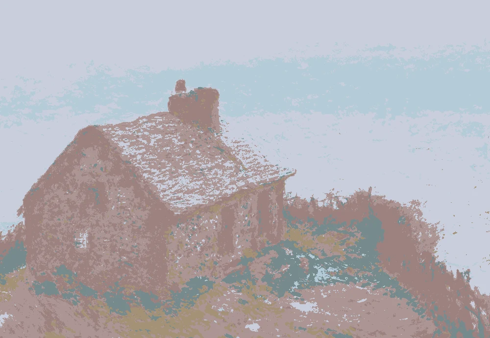
A light blue with an LRV of 62, good for kitchen walls that need to bounce light. It comes from Monet's The Customs House at Varengeville, and its closest match is Sherwin-Williams SW 6814 Breathtaking.
A very light warm yellow with an LRV of 75. It suits trim, upper cabinets or a ceiling next to the cool blues. It comes from Jacob de Wit's Allegory of Government.
A dark warm color with an LRV of only 11. Use it for a wood tone, open shelving or a small accent, not for large walls. It was measured from Simon Denis's Cloud Study.
A mid-tone with a warm red-orange undertone and an LRV of 24. It works in textiles, a runner or a single painted door. It comes from Monet's The Customs House at Varengeville.
Sherwin-Williams SW 9077 Rosaline Pearl
Very close
How the lighter colors change with the light
The same paint reads differently in cool north light, warm south sun and under evening lamps. Find the column closest to your room.
Color
Neutral daylight
North light
South light
Evening lamps
Pale Harbor Blue
Misty Blue-Gray
Clear Sky Blue
Soft Parchment
Dusty Rose Clay
Try these colors in a room
Pick which color goes on the walls, the big furniture and the bold piece. Floors, shadows and trim follow your choice.
The framed picture on the wall is The Customs House at Varengeville.
How do you choose between these cool kitchen colors?
Start with how much light the kitchen gets. The three blues sit between LRV 53 and 62, so all of them read light, but #C9CEDC is the brightest and the easiest choice for a kitchen with one small window.
Pick one blue for the largest surface and use a second only where it has a job to do. A common split is the palest blue on the walls and the slightly deeper #AFC4D5 on an island or lower cabinets. The grayer #B6C5C5 is a good middle step if the other two feel too sweet.
Keep the warm colors small. The cream and the dusty rose are there to take the chill off, not to compete with the blue.
What goes with cool blue in a kitchen: trim, ceiling and floor?
For trim and upper cabinets, the warm cream #EAE1C6 is a gentle choice. At LRV 75 it is lighter than the walls but not stark, so edges look soft instead of sharp. Its closest match is Sherwin-Williams SW 6399 Chamomile.
For the ceiling, use the same cream or a half-strength version of the wall blue. A ceiling that is lighter than the walls helps the room feel taller.
For flooring, warm wood or a tan stone tile balances the blue best. The deep olive brown #655D44 shows how dark a wood tone can go before it starts to pull attention. If your floor is gray, add the dusty rose #9C8180 in a rug or runner so the room does not turn cold.
How do these colors behave in kitchen light?
Cool colors shift more than warm ones, so test them in your own light. In north light, pale blues can look grayer and a little flatter. In strong south light they brighten and show more blue.
Under warm evening bulbs, the blues lose some of their clarity and lean softer. The cream and the rose gain warmth, so the room can feel more balanced after dark than it does at noon.
A kitchen also has glossy surfaces, such as counters, appliances and tile, that reflect the wall color back. A light blue with a high LRV will bounce more of that light, which helps in a galley or windowless kitchen. If your counters are white, expect the blue to look slightly deeper beside them.
How should you test samples before you paint?
Paint a sample board about two feet square and tape it to the wall you plan to paint. Do not paint a patch directly on the wall if there is already a strong color there, because it will skew what you see.
Move the board to two or three spots, including next to the cabinets and near the window. Look at it in the morning, at midday and in the evening with the lights on.
Place the cream and the deeper tones beside the blue on the same board. Colors change next to each other, and a blue that looks gray alone can look clearly blue beside a warm cream. Choose the one you still like at night, since a kitchen is often used most in the evening.
FAQ
What are the best cool colors for a kitchen?
Soft blues and blue-grays with an LRV above about 50 are the easiest. On this page that means #C9CEDC, #B6C5C5 and #AFC4D5.
How do I stop a cool kitchen from feeling cold?
Add a warm light color such as the cream #EAE1C6 on trim or uppers, and bring in wood or a dusty rose textile. Warm bulbs also help.
Which cool color works for kitchen cabinets?
The slightly deeper #AFC4D5 or the grayer #B6C5C5 suit cabinets, since both are light enough to stay fresh but have enough color to read as blue.
Is a pale blue kitchen good for a small room?
Yes, a color with an LRV of 62 like #C9CEDC reflects a lot of light and can make a small kitchen feel more open.
What trim color goes with cool blue kitchen walls?
A warm cream such as #EAE1C6 gives a soft edge. A clean white can work too, but it will look sharper against pale blue.
Save these colors
A card with every color on this page, its LRV and the paintings it comes from. Pin it, or take it to the paint store.
Painting images: The Art Institute of Chicago, The Metropolitan Museum of Art, public domain (CC0).
Colors measured by Light & Pigment. Paint names belong to their brands and matches are approximate. Colors look different on screen than on a wall, so always test a sample.


 From The Customs House at Varengeville, Claude Monet