19th-century French painting · art-to-room palette
Amédée-David, the Comte de Pastoret Color Palette & Paint Colors
This palette pairs two near-black greens with a deep warm brown, then lifts them with a soft apricot and a pale peach. It suits a study, library, dining room or bedroom where you want a low, enclosed, evening feel.
Quick answer
Use the pale peach #FFCDAC on the walls (LRV 68) and the apricot-tan #C79980 for the main furniture or large upholstery. Keep the deep green #253625 for an accent wall, a door or built-ins, and bring in the brown #624820 as wood and the green #32482D as textiles.
Jean Auguste Dominique Ingres, Amédée-David, the Comte de Pastoret, 1823–26.
The Art Institute of Chicago, open access.
The bar shows each color's measured share of the canvas.
The 6 colors in this painting
Measured from the image and ordered by how much of the canvas they cover. LRV is how much light a color reflects, from 0 for black to 100 for white.
Deep Forest Green
#253625 · 44.2% · LRV 3
Soft Warm Black
#181412 · 41% · LRV 1
Dark Walnut Brown
#624820 · 5.3% · LRV 7
Moss Green Textile
#32482D · 4.5% · LRV 6
Muted Apricot Tan
#C79980 · 3% · LRV 37
Pale Peach Cream
#FFCDAC · 2.1% · LRV 68
Where each color lives in the painting
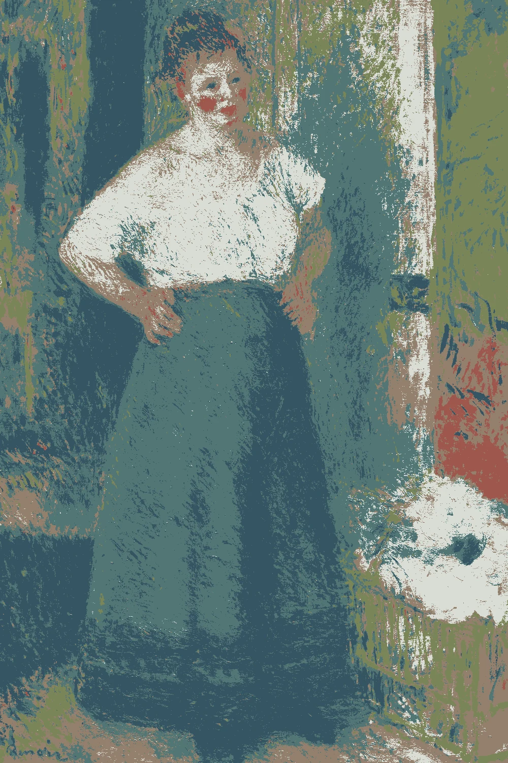
Left, every pixel of the canvas snapped to its nearest palette color. Right, the detail where each color is strongest.
The same scene in 6 flat colors.
Deep Forest GreenSoft Warm BlackDark Walnut BrownMoss Green TextileMuted Apricot TanPale Peach Cream
Closest paint colors
The nearest color from each brand. “Near-identical” and “Very close” are hard to tell apart on a wall; with “Similar”, compare a sample with the painting. Brands with nothing close are left out.
Painting color
Closest paints
LRV
Use it for
Deep Forest Green #253625
Behr BXC-12 Deep Forest
Close
Sherwin-Williams SW 2847 Roycroft Bottle Green
Similar
Paint names belong to their brands. Matches are measured from screen colors and are approximate; Light & Pigment is not affiliated with any paint brand.
How pale peach cream looks in your light
The wall color shifted for the light it will live in. Check the version closest to your room before buying a sample.
North-facing room#DCBFAE
North light is cool and flat, so the pale peach #FFCDAC (LRV 68) will read a little softer and less warm, but it still bounces light and keeps the room from feeling heavy. The deep green #253625 (LRV 3) will turn nearly black here, so use it on one wall or on trim, not on every surface.
South-facing room#FFD3B0
Strong south light brings out the red-orange warmth in the peach, so it reads as a glowing apricot cream rather than a flat pastel. The deep green holds its depth and shows more of its green, which makes it a good choice for a feature wall opposite a window.
Evening, warm lamps (2700K)#D2A680
Warm bulbs push the peach and the apricot tan #C79980 toward gold, so the room feels cozy and lamp-lit. The dark greens and the near-black #181412 will absorb most of the light, so add a few lamps at different heights to avoid dark corners.
Try the palette in a room
Pick which painting color goes on the walls, the big furniture and the bold piece. Floors, shadows and light follow your choices.
Wood takes Dark Walnut Brown and the rug border takes Moss Green Textile in every combination.
Mood board
Details from the painting next to the colors and materials that carry them into a room.
Pale Peach Cream
Muted Apricot Tan
Deep Forest Green
LinenOiled oakLime plasterAged brass
Save this palette
A card with the painting, all 6 colors and a room scheme. Pin it, or take it to the paint store.
You can, but at LRV 3 it will absorb almost all the light and feel like a cave without strong lighting. It works best in a small room used mostly at night, such as a study, with several lamps. In a larger or darker room, limit it to one wall or the built-ins.
Which color should go on the walls?
The pale peach #FFCDAC is the wall color in this palette. At LRV 68 it reflects plenty of light and gives the dark greens and brown something to sit against.
How do I use the near-black #181412 without making the room feel heavy?
Use it in small amounts, such as picture frames, lamp bases, window hardware or a single piece of furniture. With an LRV of 1, a little goes a long way, and the pale peach walls will keep the room open.
Image: The Art Institute of Chicago, Public domain (CC0).
Palette, posterized image, details and room views generated by Light & Pigment from that image.
Colors look different on screen than on a wall, so always test a sample.