19th-century French painting · art-to-room palette
The Laundress Color Palette & Paint Colors
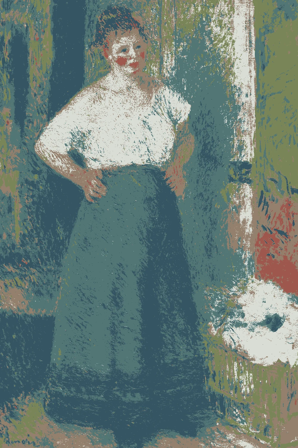
This palette comes from Renoir's The Laundress, painted 1877-79 and held by The Art Institute of Chicago. It pairs deep blue-greens with a soft pale wall, an olive green and a warm earthy brown, and it suits a calm living room, a study or a bedroom.
Quick answer
Put the pale gray-green #D9DDD6 on the walls, and use the warm taupe #93806D for main pieces like a sofa, rug or curtains. Save the olive #7A8557 for an accent chair or pillows, and the brick red #9F584D for small textiles such as a throw. The two deep blues work as a feature wall, cabinet or door color.
Pierre-Auguste Renoir, The Laundress, 1877–79.
The Art Institute of Chicago, open access.
The bar shows each color's measured share of the canvas.
The 6 colors in this painting
Measured from the image and ordered by how much of the canvas they cover. LRV is how much light a color reflects, from 0 for black to 100 for white.
Deep Teal Green
#527676 · 34.5% · LRV 16
Dark Slate Blue
#365563 · 25.9% · LRV 8
Warm Putty Taupe
#93806D · 14.2% · LRV 23
Pale Gray Mist
#D9DDD6 · 12.4% · LRV 71
Soft Olive Green
#7A8557 · 11.4% · LRV 22
Muted Brick Red
#9F584D · 1.6% · LRV 15
Where each color lives in the painting
Left, every pixel of the canvas snapped to its nearest palette color. Right, the detail where each color is strongest.
The same scene in 6 flat colors.
Deep Teal GreenDark Slate BlueWarm Putty TaupePale Gray MistSoft Olive GreenMuted Brick Red
Closest paint colors
The nearest color from each brand. “Near-identical” and “Very close” are hard to tell apart on a wall; with “Similar”, compare a sample with the painting. Brands with nothing close are left out.
Farrow & Ball No. 42 Picture Gallery Red
Very close
Behr PPU2-15 Cajun Red
Very close
Valspar 2001-5A Toasted Cranberry
Very close
15
One small textile
Paint names belong to their brands. Matches are measured from screen colors and are approximate; Light & Pigment is not affiliated with any paint brand.
How pale gray mist looks in your light
The wall color shifted for the light it will live in. Check the version closest to your room before buying a sample.
North-facing room#C3C9C9
The pale wall color #D9DDD6 has an LRV of 71, so it bounces back plenty of light, but north light is cool and may push it toward a cooler, grayer look. Warm taupe and brick red accents help keep the room from feeling chilly.
South-facing room#E1DFD1
In strong south light, #D9DDD6 stays soft and clean because it has no clear undertone. Its high LRV of 71 means it can look bright at midday, so pair it with the deeper blues or olive to give the eye somewhere to rest.
Evening, warm lamps (2700K)#BCB098
Warm bulbs will add a yellow cast to #D9DDD6 and make it feel softer and creamier. The deep blues (LRV 16 and 8) will look darker and moodier, while the taupe and brick red will glow.
Try the palette in a room
Pick which painting color goes on the walls, the big furniture and the bold piece. Floors, shadows and light follow your choices.
Wood takes a warm mid-brown and the rug border takes Muted Brick Red in every combination.
Mood board
Details from the painting next to the colors and materials that carry them into a room.
Pale Gray Mist
Warm Putty Taupe
Soft Olive Green
LinenOiled oakLime plasterAged brass
Save this palette
A card with the painting, all 6 colors and a room scheme. Pin it, or take it to the paint store.
Can I paint a whole room in the deep teal or dark blue?
You can, but with LRVs of 16 and 8 they absorb most of the light and read very dark. They work best in a small room, or on one wall or built-in cabinet, with the pale wall color elsewhere.
Which color should I use on the walls?
Use #D9DDD6 for walls. At LRV 71 it reads light, reflects light around the room and lets the darker colors work as furniture, trim or a feature wall.
How do I use the brick red without overwhelming the room?
Keep it small. The brick red #9F584D covers only 1.6% of the painting, so a few pillows, a throw or a small piece of art is enough. Its warm red-orange undertone stands out against the cool blues.
Image: The Art Institute of Chicago, Public domain (CC0).
Palette, posterized image, details and room views generated by Light & Pigment from that image.
Colors look different on screen than on a wall, so always test a sample.