Mid-century modern style · colors from 5 paintings
Mid Century Color Palette for Your Home
This mid century color palette has six colors: a light cream, three warm mid-tones, a deep teal and a very dark brown. Each one was measured from a painting and comes with its LRV, its undertone and the closest paint matches. Together they give you a warm, earthy mid century modern color scheme for walls, wood, furniture and textiles.
Quick answer
Use the cream (LRV 69) on the walls, the olive taupe and walnut gold on furniture and wood, and the apricot or teal as one bold piece. Keep the dark brown for textiles.
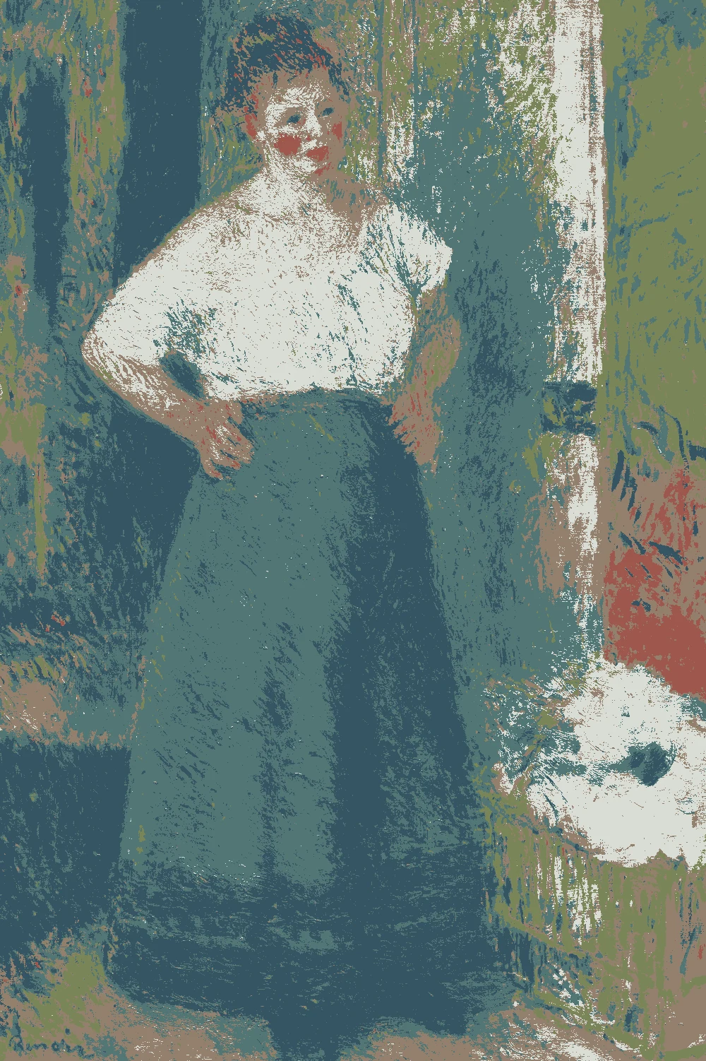
Every color on this page was measured from one of these public-domain paintings.
The palette
#977143LRV 19
Walnut Gold
A mid-tone with a warm yellow undertone and an LRV of 19, so it reads like medium wood. Use it for a table, a sideboard or shelving. Measured from "The Red Room, Etretat" by Félix Edouard Vallotton, 1899.
Sherwin-Williams SW 2824 Renwick Golden Oak
Very close
Valspar 3011-5 Autumn Surprise
Close
#527676LRV 16
Deep Teal Blue
A deep, cool blue-green with an LRV of 16. It is the only cool color here, so use it on one chair, one door or one den wall. Measured from "The Laundress" by Pierre-Auguste Renoir, 1877–79.
A calm mid-tone with a warm yellow undertone and an LRV of 23. Use it on a large sofa or an upholstered chair, where it sits quietly next to cream walls. Measured from "Flower Girl in Holland" by George Hitchcock, 1887.
A warm red-orange mid-tone with an LRV of 32, the brightest of the accents. Give it one piece, such as a lounge chair or a set of pillows. Measured from "Woman's Head" by Albert Besnard, c. 1890.
A very dark, warm red-orange brown with an LRV of 3. It suits rugs, curtains and small cabinets, where it adds depth without darkening the room. Measured from "The Red Room, Etretat" by Félix Edouard Vallotton, 1899.
A very light cream with a warm yellow undertone and an LRV of 69, so it bounces daylight. Use it on the walls of any room in the palette. Measured from "Landscape" by Jean Charles Cazin, c. 1895.
The same paint reads differently in cool north light, warm south sun and under evening lamps. Find the column closest to your room.
Color
Neutral daylight
North light
South light
Evening lamps
Burnt Apricot
Warm Cream Sand
Try these colors in a room
Pick which color goes on the walls, the big furniture and the bold piece. Floors, shadows and trim follow your choice.
The framed picture on the wall is The Red Room, Etretat.
How do you choose between these mid century colors?
Start with the wall, because it sets the light for everything else. Warm Cream Sand (#E7D6BC, LRV 69) is the one light color in this palette, so it does the work of reflecting daylight. The other five sit between LRV 3 and 32, which means they absorb more light than they bounce.
A simple way to divide the palette: one light color for walls, one or two mid-tones for large pieces and wood, one accent, and one dark for small areas. The olive taupe (LRV 23) and the walnut gold (LRV 19) are close in depth, so they sit well together on a sofa and a wood table.
Use the deep teal (LRV 16) sparingly. It is the only cool color here, and it stands out against the warm yellow and red-orange ones. One chair, one door or one wall in a den is plenty. The burnt apricot (LRV 32) is the brightest accent, so give it a single piece, such as a lounge chair or a pair of pillows.
What goes with these colors: trim, ceiling and flooring?
Keep trim and ceiling close to the wall color. Sherwin-Williams SW 7573 Eaglet Beige is a near-identical match for the cream, so painting the trim and ceiling the same color gives a soft, even room. A bright white trim next to this cream can look cold and sharp by comparison, so test it before you commit.
For flooring, the walnut gold (#977143, LRV 19) is a guide for medium wood floors and furniture. Its warm yellow undertone sits comfortably against the cream walls. If your floor is very dark, remember that the brown here has an LRV of 3. A floor that deep will make the room feel smaller unless the walls stay light.
Rugs and textiles are where the darker colors fit best. A dark espresso rug or curtain anchors a room without adding a second wall color. The olive taupe suits upholstery, because its LRV of 23 reads calm beside the cream. Keep the teal and the apricot to cushions, art or a single chair so they do not compete.
How do these colors look in different light?
Light changes these colors more than most people expect. In a north-facing room, daylight is cooler. The cream can look a little grayer, and the deep teal gets darker and bluer. Put the cream on all the walls there to keep the room from feeling heavy.
In a south- or west-facing room, the light is warmer and stronger. The warm yellow undertones in the cream, the olive taupe and the walnut gold all come forward. The burnt apricot can start to look more orange. If that is too much, keep it to small items.
Evening lamps with warm bulbs add more yellow. The espresso brown (LRV 3) will look almost black at night, which is fine for a textile or a small cabinet. In a small or dim room, avoid putting the darkest colors on several large surfaces. With walls at LRV 69 and a few low-LRV pieces, the room stays bright enough while the furniture still has depth.
How do you test the samples?
Test every color in your own room before you buy a gallon. Paint each sample on a large board, at least two feet square, and leave a white border. Do not paint a small patch on the wall, since the old color will change how the new one looks.
Move the boards around. Check them in the morning, at midday and at night with the lamps on. Set them next to your floor, sofa and curtains, because those colors change how a sample reads.
The paint matches on this page are the closest measured to each color, not exact copies. Some are near-identical, like Sherwin-Williams SW 9 Eastlake Gold for the apricot. Others are only close, like SW 18 Teal Stencil for the teal. Compare the card to your board. For the dark brown, the closest match is Sherwin-Williams SW 6069 French Roast, and a dark color may need two coats to show its full depth. Choose the sample you still like after a full day of light.
FAQ
What colors are in a mid century modern color palette?
This palette has six: warm cream sand, olive taupe, walnut gold, burnt apricot, deep teal blue and dark espresso brown. Five are warm and one is cool, and each was measured from a painting.
What is a good mid century color scheme for walls?
Warm Cream Sand (#E7D6BC, LRV 69) is the wall color in this palette. Near matches include Sherwin-Williams Eaglet Beige, Behr Moongaze and Farrow & Ball Matchstick.
Can I use dark colors in a mid century home?
Yes, in small amounts. The dark espresso brown has an LRV of 3, so it works best on rugs, curtains or a small cabinet. The deep teal (LRV 16) works as a single accent.
Is this an authentic mid century modern color palette?
These colors were measured from paintings, not from period paint cards. They fit the warm, earthy look of the style, but they are not a record of what was sold at the time.
How many colors should one room use?
Three or four is a good limit. Use the cream on the walls, one or two mid-tones for furniture and wood, and one accent such as the teal or the apricot.
Save these colors
A card with every color on this page, its LRV and the paintings it comes from. Pin it, or take it to the paint store.
Painting images: The Art Institute of Chicago, public domain (CC0).
Colors measured by Light & Pigment. Paint names belong to their brands and matches are approximate. Colors look different on screen than on a wall, so always test a sample.


 From The Red Room, Etretat, Félix Edouard Vallotton