North-facing room
#C8BEB2North light is cooler and softer, so the parchment wall can look a little flat or grayer than the swatch. Its LRV of 61 keeps the room bright enough to feel open.
Paint colors for your home, inside and out
14th-century painting · art-to-room palette
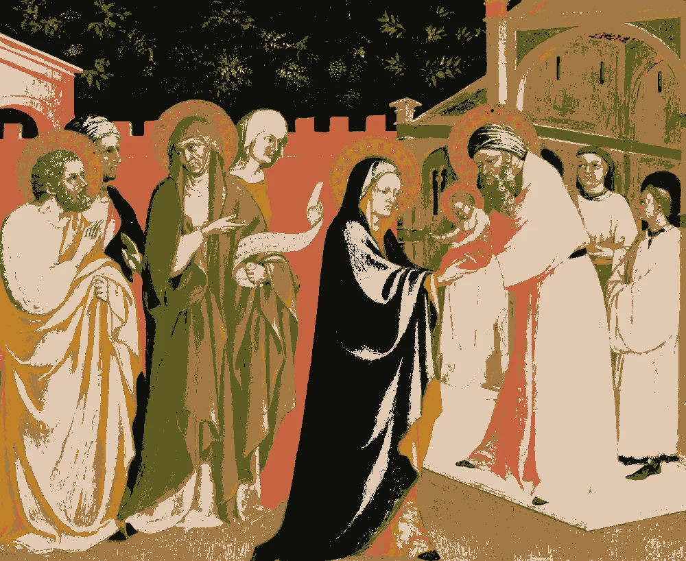
This palette comes from Alvaro Pirez's tempera and gold panel "The Presentation in the Temple," painted about 1405 to 1415 and held by The Metropolitan Museum of Art. It is built on warm parchment, ochre browns, and deep olive, with a few sharp notes of red-orange and near-black, so it suits rooms that want warmth with some depth.
Quick answer
Use the pale parchment #E0CAB1 on the walls, since it is the largest share and the lightest color. Use the ochre brown #A27944 for main furniture or a large rug, and the terracotta #C66340 for a few accents such as cushions or pottery.

Measured from the image and ordered by how much of the canvas they cover. LRV is how much light a color reflects, from 0 for black to 100 for white.
Left, every pixel of the canvas snapped to its nearest palette color. Right, the detail where each color is strongest.


The nearest color from each brand. “Near-identical” and “Very close” are hard to tell apart on a wall; with “Similar”, compare a sample with the painting. Brands with nothing close are left out.
| Painting color | Closest paints | LRV | Use it for |
|---|---|---|---|
Pale warm parchment#E0CAB1 |
|
61 | Main walls |
Burnished ochre brown#A27944 |
|
22 | Bed, sofa, curtains |
Near-black ink#0E0E0A |
|
0 | Small accents, art, accessories |
Deep olive bronze#5E5C23 |
|
10 | Small accents, art, accessories |
Terracotta red-orange#C66340 |
|
21 | One bold piece |
Golden amber ochre#C08127 |
|
27 | One small textile |
Paint names belong to their brands. Matches are measured from screen colors and are approximate; Light & Pigment is not affiliated with any paint brand.
The wall color shifted for the light it will live in. Check the version closest to your room before buying a sample.
#C8BEB2North light is cooler and softer, so the parchment wall can look a little flat or grayer than the swatch. Its LRV of 61 keeps the room bright enough to feel open.
#E7D0B4Strong south light brings out the yellow in the parchment, so it reads as a clean, warm cream. Test it on the wall that gets the most sun, since the color can look brighter than expected.
#C0A583Under warm evening bulbs the parchment takes on a honey tone and the room feels cozy. The ochre and amber pieces will look richer, and the olive may appear slightly darker.
Pick which painting color goes on the walls, the big furniture and the bold piece. Floors, shadows and light follow your choices.
Wood takes a warm mid-brown and the rug border takes Golden amber ochre in every combination.
Details from the painting next to the colors and materials that carry them into a room.

A card with the painting, all 6 colors and a room scheme. Pin it, or take it to the paint store.
The near-black #0E0E0A has an LRV of 0, so it absorbs nearly all light. Use it for trim, a door, or a single accent wall in a room with good daylight rather than a full room.
Yes. Its LRV of 61 reads light and bounces light around, which helps a small or dim room feel larger. Pair it with the ochre and olive in soft fabrics to keep the room from feeling blank.
Follow the painting's balance. The parchment covers the largest share, then the ochre brown, with the deep olive, near-black, terracotta and amber used in smaller amounts. Keep the dark and accent colors to a smaller share so they stay as highlights.
Image: The Metropolitan Museum of Art, Public domain (CC0). Palette, posterized image, details and room views generated by Light & Pigment from that image. Colors look different on screen than on a wall, so always test a sample.


