House exterior · Craftsman · colors from 6 paintings
Craftsman Exterior Color Scheme: 4 Complete Palettes for Walls, Trim and Door
A good Craftsman exterior color scheme uses one grounded wall color, a soft light trim and a door color that stands out. The four schemes below give you each piece, plus a roof color. Every wall color was measured from a public-domain painting and comes with its LRV and closest paint matches.
Quick answer
Put the deep brown, olive or taupe on the walls, the pale green-white on trim, fascia and garage door, and the sage, amber, red-orange or espresso on the front door and shutters. Use the lighter straw yellow when you want a brighter bungalow.
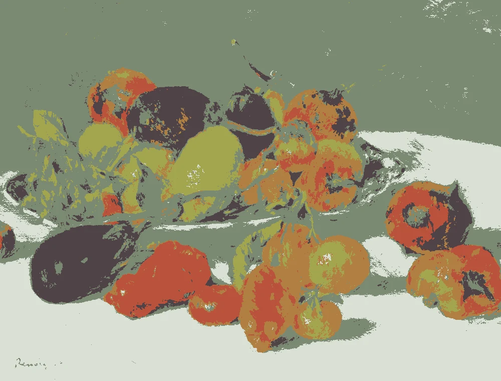
Every wall, trim and door color here was measured from one of these public-domain paintings.
4 complete exterior color schemes
Walls, trim, front door and roof together. Each scheme takes its colors from public-domain paintings, so the pairings are ones a painter already put side by side.
Dark Walnut and Sage
Walls #483A30
Trim #D9E0D6
Front door & shutters #7B8972
Roof: brown
Very dark brown walls with pale sage-white trim, a soft green front door and shutters, and a brown roof. This is the most dramatic palette here and suits a shaded lot.
Light straw yellow walls with pale sage-white trim, an amber front door and shutters, and a black roof. It is the brightest scheme and works well on a small bungalow.
Colors from Whalers, Joseph Mallord William Turner.
Closest paints for this scheme
Walls
Behr BXC-80 Wildwood
Very close
Sherwin-Williams SW 7732 Lemongrass
Very close
Valspar 6006-5B Parlour Sage
Very close
Farrow & Ball No. 16 Cord
Close
Trim
Valspar 5003-1A Quiet Mint
Very close
Behr 790C-2 Silver Drop
Very close
Sherwin-Williams SW 6455 Fleeting Green
Very close
Deep olive walls with pale sage-white trim, a brick red-orange front door and shutters, and a brown roof. The red door gives the dark walls a clear focal point.
Warm taupe walls with pale sage-white trim, an espresso front door and shutters, and a brown roof. It is the calmest scheme and sits well beside stone or brick.
Exterior paint is seen in much stronger light than a room. Full sun bleaches a color by a shade or two, while the shaded side of the house and overcast days pull it cooler and darker. Test a large sample on two sides of the house.
Color
Swatch
Full sun
Overcast
In shade
Golden hour
Dark Walnut Brown LRV 5
Soft Straw Yellow LRV 56
Deep Olive Gold LRV 10
Warm Stone Taupe LRV 16
Pale Sage White LRV 73
Try these colors on a house
Pick a color for the walls, the trim, the front door and the roof, and switch between house styles. Shadows and siding lines follow your choice.
Roof colors are typical shingle, tile and metal colors, not paint. Every other color comes from a painting on this page.
Colors for the walls
#483A30LRV 5
Dark Walnut Brown
A very dark wall color with a warm red-orange undertone and an LRV of 5, measured from "Portrait of an Old Woman" by Jacob Backer. Use it on siding or stucco when you want a deep, quiet house under a brown roof.
A light wall color with a warm yellow undertone and an LRV of 56, measured from "Whalers" by Joseph Mallord William Turner, ca. 1845. It keeps a small bungalow bright, and full sun will make it read lighter still.
A deep wall color with a warm yellow undertone and an LRV of 10, measured from "Ecce Agnus Dei" by Giovanni di Paolo, 1455-60. It suits a house with plenty of shade, where it reads as a rich olive-brown.
A deep taupe with a warm red-orange undertone and an LRV of 16, measured from "Mother and Child by the Sea" by Johan Christian Dahl, 1830. It is a softer choice than the darkest browns and works well beside stone or brick.
A very light trim color with a green undertone and an LRV of 73, measured from "Fruits of the Midi" by Pierre-Auguste Renoir, 1881. Use it on trim, fascia and the garage door so it bounces light back under the eaves.
Sherwin-Williams SW 6455 Fleeting Green
Very close
Farrow & Ball No. 204 Pale Powder
Very close
Front door and shutter colors
#7B8972LRV 23
Soft Sage Green
A mid-tone door color with a green undertone and an LRV of 23, measured from "Fruits of the Midi" by Pierre-Auguste Renoir, 1881. It stands out gently against a very dark wall and suits shutters too.
A mid-tone door color with a warm yellow undertone and an LRV of 25, measured from "Fruits of the Midi" by Pierre-Auguste Renoir, 1881. It makes a clear focal point against light straw walls.
A deep door color with a warm red-orange undertone and an LRV of 17, measured from "Fruits of the Midi" by Pierre-Auguste Renoir, 1881. It adds the strongest accent in the set against dark olive walls.
A very dark door color with a warm red-orange undertone and an LRV of 2, measured from "Allegory of Avarice" by Jacopo Ligozzi. Use it on a front door and shutters when you want a tone-on-tone look against taupe walls.
How do you choose a wall color for a Craftsman house?
Start with what will not change. The roof, a brick chimney, a stone porch base and the foundation stay as they are, so the wall color has to work with them. Hold a shingle or a brick sample next to each paint chip and compare the undertones. Warm red-orange stone goes well with the dark brown or taupe walls here. A black roof suits the light straw yellow, and a brown roof suits the dark brown, olive and taupe.
Then think about size and shade. A small bungalow with a deep porch often looks good in a dark wall, because the shadow under the eaves is already dark. A light wall like the straw yellow, with an LRV of 56, shows off porch columns and window trim and keeps a small house from feeling heavy.
Pick the wall color first, then the trim, then the door. One wall color and one trim color is the easiest place to start.
How much contrast should trim and the front door have?
Trim sets the outline of the house. All four schemes use the same pale sage-white, LRV 73. Against the very dark brown walls, LRV 5, that gap is large and crisp. Against the straw yellow, LRV 56, it is softer and quieter. Use the same trim color on fascia, window trim and the garage door so the house reads as one piece.
The front door should be the strongest accent. On the light straw wall, the amber door at LRV 25 is easy to spot from the street. On the deep olive walls, the brick red-orange door adds warmth against a dark background. On the dark brown walls, the soft sage door, LRV 23, stands out without shouting.
The taupe scheme works the other way. Its espresso door, LRV 2, is darker than the walls at LRV 16, so the effect is deep and tone-on-tone. Paint shutters the same color as the door.
Why do exterior colors look lighter in sun and cooler in shade?
Outdoors, daylight is far stronger than indoor light. A color that looks medium on a small chip often looks a step lighter on a big wall in full sun. That is why it helps to choose a shade darker than the one you like on the chip.
Shade does the opposite. On the north side of a house or under a deep porch roof, the same paint looks cooler and darker. Warm yellow and red-orange undertones can look flatter there. Pale trim with a green undertone, like the sage-white here, can look cooler in shade and cleaner in sun.
This matters most for the lighter colors. The straw yellow, LRV 56, will glow in direct sun, so check it against a slightly deeper option before you commit. The darkest browns, LRV 5 and LRV 10, will look closer to black in shade, so judge them on the side of the house that gets the least light as well as the brightest.
How do you test exterior paint colors before painting?
Use large samples. Paint boards or poster board at least two feet square, with two coats, rather than small spots on the siding. Keep a white border around each so you see the color on its own.
Test on two sides of the house, one in full sun and one in shade. Look at the samples in the morning, at midday, in late afternoon and at dusk. Move them around so you see each color next to the roof, the brick or stone, and the trim color.
Put the door and trim samples next to the wall sample. The three colors work together, and a color that looks right alone can change beside its neighbors. Give it a day or two, and look on a cloudy day too if you can.
The paint matches on this page are the closest measured colors, not exact. Always sample the paint you plan to buy.
FAQ
What is a good color scheme for a Craftsman exterior?
Choose a grounded wall color, a light trim and a door that stands out. Try dark brown, deep olive or warm taupe walls, or light straw yellow for a brighter house. Add the pale sage-white trim and a door in sage, amber, red-orange or espresso.
What colors work for a bungalow exterior?
Warm, earthy colors suit a bungalow. The schemes here use brown, olive, taupe and straw yellow on the walls, with pale trim. A light wall like the straw yellow, LRV 56, helps a small bungalow feel open.
What color should the front door be on a Craftsman house?
Pick a door that is clearly different from the walls. Amber suits light straw walls, brick red-orange suits deep olive walls, and soft sage suits very dark brown walls. Espresso suits taupe walls if you want a quiet look.
What roof color goes with these Craftsman color schemes?
Three of the four schemes use a brown roof, with the dark brown, deep olive and taupe walls. The light straw yellow scheme uses a black roof. If your roof is staying, match the scheme to its undertone first.
Should Craftsman trim be white?
It does not have to be pure white. These schemes use a very light sage-white with a green undertone and an LRV of 73. It reads light and clean without the sharp edge of a bright white.
Save these colors
A card with these house color schemes: walls, trim, front door and roof. Pin it, or take it to the paint store.
Painting images: The Metropolitan Museum of Art, The Art Institute of Chicago, public domain (CC0).
Colors measured by Light & Pigment. Paint names belong to their brands and matches are approximate. Colors look different on screen than on a wall, so always test a sample.