North Facing Kitchen Colors: Warm Paints That Balance Cool Light
A north facing kitchen gets cool, indirect light all day, so the best paint colors lean warm and light. Pick a wall color with a warm undertone and an LRV above 50, then add deep tones for cabinets, wood or accents. Each color below was measured from a public-domain painting and comes with its closest commercial paints.
Quick answer
Use #EAE5C7 or #EBDCC4 on the walls for the most light and warmth. Save the deep olive #454536 and brown #47342B for an island, cabinets or wood.
Every color on this page was measured from one of these public-domain paintings.
Wall colors
#EAE5C7LRV 78
Soft Straw Cream
The best all-round kitchen wall color here: LRV 78 bounces plenty of light, and the warm yellow undertone offsets cool north light. Measured from Landscape with Tournament and Hunters by Jan van Scorel.
A creamier wall color at LRV 73, good when you want warmth without going yellow. Its warm yellow undertone keeps the room from feeling chilly. Measured from Arlésiennes (Mistral) by Paul Gauguin.
At LRV 58 with a warm red-orange undertone, it suits one wall, a nook, or a painted piece of furniture. Measured from New England Scenery by Thomas Cole.
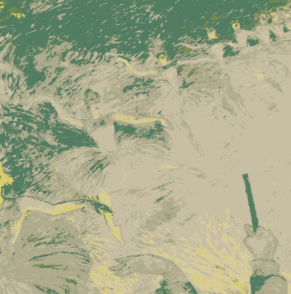
A yellow-leaning khaki at LRV 52, best for textiles or a single wall in a kitchen with decent window size. It will look deeper in north light than the lighter colors. Measured from Ballet Dancers by Henri de Toulouse-Lautrec.
At LRV 4 this is a rich brown for wood, open shelves or a small accent, where its warm red-orange undertone adds depth. Measured from After the Bullfight by Mary Cassatt.
A very dark green (LRV 6) for an island or lower cabinets in a kitchen that embraces its shade. Balance it with light walls so the room stays usable. Measured from Saint John the Baptist Entering the Wilderness by Giovanni di Paolo.
The same paint reads differently in cool north light, warm south sun and under evening lamps. Find the column closest to your room.
Color
Neutral daylight
North light
South light
Evening lamps
Soft Straw Cream
Warm Parchment
Soft Clay Beige
Dry Grass Khaki
Try these colors in a room
Pick which color goes on the walls, the big furniture and the bold piece. Floors, shadows and trim follow your choice.
The framed picture on the wall is Landscape with Tournament and Hunters.
How do I choose between these north facing kitchen paint colors?
Start with LRV. North light is cool and indirect, so it does not add much brightness or warmth on its own. The two lightest walls, #EAE5C7 at LRV 78 and #EBDCC4 at LRV 73, give back the most light. Both have a warm yellow undertone, which works against the cool cast of the room.
Choose #EAE5C7 if the kitchen is small, has few windows, or needs to feel as bright as possible. Choose #EBDCC4 if you want a little more depth and a creamier, parchment feel. Both sit well away from stark white.
The two mid-light colors work differently. #DFC4AE, LRV 58, has a warm red-orange undertone and reads as soft clay. #C6BFA4, LRV 52, leans yellow and reads as khaki. Both suit a single wall, a breakfast nook, or a kitchen with generous windows. On all four walls of a dim kitchen they can feel heavy.
Keep the two deep colors for cabinets, an island, or a small accent area.
What goes with these colors: trim, ceiling, cabinets and floors?
Trim and ceiling. With #EAE5C7 or #EBDCC4 on the walls, keep the ceiling the same color or a shade lighter so the room does not feel closed in. Trim can match the walls for a calm look, or be a creamy white. A cold, blue-leaning white can look sharp against these warm walls in north light, so test it first.
Cabinets and wood. Try #454536 on the island or lower cabinets and #47342B on wood such as shelves, a table or a butcher block. Both are very dark, with LRV 6 and 4, so use them in measured amounts and let the light walls carry the room.
Accents and textiles. #DFC4AE works for a bold piece such as a bench, a stool or a single set of doors. #C6BFA4 suits roman shades, a runner or seat cushions.
Flooring. Warm wood, tan tile, or stone with a cream base all sit well here. Cool gray floors can add to the chill of north light.
How do these colors look in north light?
North light is steady and cool. It does not bring in the warm glow that a sunnier room gets, so colors look much the same through the day. That makes choosing easier, but it also means a wall will not warm itself up.
Warm undertones help. The yellow in #EAE5C7, #EBDCC4 and #C6BFA4, and the red-orange in #DFC4AE, stay visible in cool light and keep the walls from turning gray. Expect every color to look a little cooler on the wall than it does on a small chip.
LRV matters more here than in a bright room. #C6BFA4 at LRV 52 will look noticeably deeper than #EAE5C7 at LRV 78. The deep colors, #47342B and #454536, can look close to black in shade and show their warmth mostly near the window or under lights.
Evening lighting does a lot of work in a kitchen. Warm white bulbs make all of these colors glow, so check them again at night, including under task lights over the counters.
How do I test paint for a north facing kitchen?
Test on the wall, not just on a chip. Paint a sample on a large piece of white board, about two feet square, and tape it up so you can move it. Put one on the wall facing the window and one on a side wall, since each gets different light.
Look at the samples in the morning, at midday and in the evening with the lights on. Hold them next to your cabinets, counters, backsplash and floor. If a color looks gray or greenish beside them, move toward a warmer option.
Use the closest matches as a starting point. For #EAE5C7, the closest match measured was Sherwin-Williams SW 6421 Celery, very close, with Behr S320-2 Pale Parsnip near-identical. Buy samples of two or three candidates and compare them side by side.
Matches are close, not exact, so always confirm the color on your own wall before buying gallons.
FAQ
What is the best color for a north facing kitchen?
A light, warm color such as #EAE5C7, which has an LRV of 78 and a warm yellow undertone. It reflects plenty of light and offsets the cool cast of north light.
Can I use a dark color in a north facing kitchen?
Yes, if you want a cocooning room or just an accent. Deep olive #454536 (LRV 6) or brown #47342B (LRV 4) works best on an island, cabinets or wood, with light walls and warm bulbs to balance them.
What is a good north facing kitchen color scheme?
Use #EAE5C7 on the walls, #454536 on the main furniture or island, #47342B for wood, #DFC4AE for a bold piece and #C6BFA4 for textiles. Light warm walls with a few deep tones keep the room bright and grounded.
Should I avoid gray or white paint in a north facing kitchen?
Cool grays and blue-leaning whites can feel colder in north light. Warm colors with a yellow or red-orange undertone, like the walls on this page, tend to feel more welcoming.
Which paint is closest to #EAE5C7?
The closest matches measured are Sherwin-Williams SW 6421 Celery (very close), Behr S320-2 Pale Parsnip (near-identical) and Farrow & Ball No. 2012 House White (very close). Test a sample in your kitchen before committing.
Save these colors
A card with every color on this page, its LRV and the paintings it comes from. Pin it, or take it to the paint store.
Painting images: The Art Institute of Chicago, public domain (CC0).
Colors measured by Light & Pigment. Paint names belong to their brands and matches are approximate. Colors look different on screen than on a wall, so always test a sample.


 From Landscape with Tournament and Hunters, Jan van Scorel