South-facing rooms get strong, warm light, so the safest wall colors lean neutral or green, like a gray at LRV 44 or a soft sage at LRV 50. The yellow-leaning colors work too, but they will glow warmer. Save the deep colors for contrast.
Quick answer
Use #B2B1B6 or #BBBEA8 on the walls, #CFC5A1 or #B5AE91 when you want a warmer glow, and keep #495248 and #1A3037 for one wall, a door or textiles.
Every color on this page was measured from one of these public-domain paintings.
Wall colors
#CFC5A1LRV 56
Pale Straw Khaki
The lightest wall color here at LRV 56, with a warm yellow undertone. Use it where you want a soft glow, knowing south light will push it warmer. It comes from Whalers by Joseph Mallord William Turner.
A light green-leaning color at LRV 50 that adds little extra warmth in strong sun. Good for living room or bedroom walls, or for a large piece of furniture. It comes from On the Seine by Homer Dodge Martin.
A light neutral at LRV 44 with no clear undertone, so it will not pull yellow at midday as readily as the warmer colors. Use it on walls in a room with lots of sun. It comes from Madonna and Child with Two Angels by Botticelli.
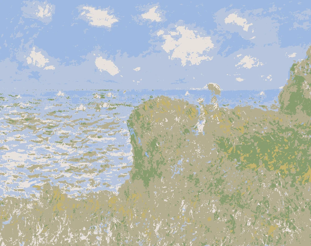
A warm yellow-undertone color at LRV 42, deeper than the straw tone. Use it on an accent piece such as an armchair, or on walls if you want a cozy room. It comes from Cliff Walk at Pourville by Claude Monet.
A deep green-undertone color at LRV 8. Use it on one wall, a door or built-ins, where strong light shows its depth. It comes from Young Girl in a Pink-and-Black Hat by Auguste Renoir.
A very dark, cool blue at LRV 3. It gives a south-facing room a cool counterpoint in curtains, a throw or a painted cabinet. It comes from Portrait of a Young Man by Cosmè Tura.
The same paint reads differently in cool north light, warm south sun and under evening lamps. Find the column closest to your room.
Color
Neutral daylight
North light
South light
Evening lamps
Pale Straw Khaki
Quiet Sage
Neutral Dove Gray
Warm Moss Khaki
Try these colors in a room
Pick which color goes on the walls, the big furniture and the bold piece. Floors, shadows and trim follow your choice.
The framed picture on the wall is Whalers.
How do I choose a wall color for a south-facing room?
South light is strong and warm for most of the day, and it adds yellow to whatever it touches. Start with undertone. The neutral gray #B2B1B6 (LRV 44) and the green-leaning #BBBEA8 (LRV 50) add the least extra warmth. The yellow-leaning #CFC5A1 (LRV 56) and #B5AE91 (LRV 42) will read warmer still, so choose them when you want a glow, not a crisp look.
Then check brightness. At LRV 56, #CFC5A1 is the lightest wall color here and bounces the most light. A south room often has light to spare, so a mid-range color between LRV 42 and 50 can feel calmer on the wall that takes the sun.
Keep the deep colors, #495248 (LRV 8) and #1A3037 (LRV 3), for one wall, a door, cabinets or built-ins. Strong light shows their depth instead of making them feel heavy.
What goes with these colors: trim, ceiling and floors?
For trim and ceiling, use a soft white. A very cool, stark white can look icy beside the yellow-leaning walls, while a softer white sits closer to them. Against the gray #B2B1B6, a clean white gives the sharpest edge.
For floors, a mid-brown wood like #8B6B4A suits every wall color on this page. Against the gray it adds warmth. Against the green-leaning #BBBEA8 it looks earthy. Darker floors sit best under the lighter walls, around LRV 50 to 56.
For furniture and textiles, try this scheme. Walls in #CFC5A1, a sofa or sideboard in #BBBEA8, wood at #8B6B4A, an armchair or pillow in #B5AE91, and curtains or a throw in #1A3037. The light colors stay close in value, so the dark textile gives the room its one strong contrast.
How will these colors look at different times of day?
South light builds through the morning, and walls look soft and warm. By midday it is at its strongest, and the walls look their lightest and warmest. #CFC5A1 and #B5AE91 will lean most yellow then.
Walls far from the window, and corners, get less light. Colors there look deeper and a little grayer. That is why you should look at a color on both the window wall and the wall opposite it.
In the evening, warm bulbs add more yellow. If your lamps are warm, the green-leaning and gray colors hold their character best. The deep colors absorb most of the light, at LRV 8 and 3, so they stay rich in a south room and do not wash out at midday. Add a few lamps if the room feels dim after dark.
How should I test paint samples in a south-facing room?
Test big. Paint a sample at least two feet square on the wall, or on a board you can move around. Use two coats, and leave a white border so you judge the color and not the old wall.
Look at it at three times: morning, midday and early evening. Check it on the window wall and on the opposite wall. Hold it next to your trim white, your floor and your sofa fabric.
The paints listed are the closest matches measured from each painting, so a match can still shift in your room. Sample the closest two or three and live with them for a few days before you buy gallons. If a color turns too yellow at midday, move one step toward the gray or the green.
FAQ
What is the best paint color for a south-facing room?
The neutral gray #B2B1B6 (LRV 44) and the green-leaning #BBBEA8 (LRV 50) add the least extra warmth in strong sun. Choose the yellow-leaning colors if you want a warmer glow.
Why do some colors look yellow in a south-facing room?
South light is warm for most of the day, and it adds yellow to colors. Colors with a yellow undertone, like #CFC5A1 and #B5AE91, will read warmest.
Can I use dark colors in a south-facing room?
Yes. #495248 (LRV 8) and #1A3037 (LRV 3) work well on one wall, a door, cabinets or textiles. Strong light shows their depth.
Does LRV matter in a south-facing room?
It does, but the room often has light to spare. The wall colors here range from LRV 42 to 56, which read as light to mid-light. Colors below about 20 read very dark.
Which paint is the closest match to the gray wall color?
For #B2B1B6, Sherwin-Williams SW 6261 Swanky Gray is a near-identical match. Behr 730B-4 Winter Cocoa and Valspar 4005-1C Metropolis are very close. Always test the paint in your own room.
Save these colors
A card with every color on this page, its LRV and the paintings it comes from. Pin it, or take it to the paint store.
Painting images: The Metropolitan Museum of Art, The Art Institute of Chicago, public domain (CC0).
Colors measured by Light & Pigment. Paint names belong to their brands and matches are approximate. Colors look different on screen than on a wall, so always test a sample.


 From Whalers, Joseph Mallord William Turner