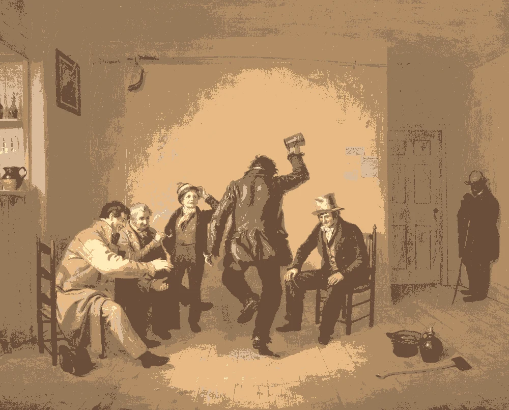
Pastel paint colors are light and soft, but they are not all the same. These nine colors were measured from paintings: six pastel shades from light to mid-tone, and three companions that help them look grown-up.
Quick answer
Use cream #ECE2C0 on the walls, add peach #FBBD98 and sage #BEC78A in textiles, and ground the room with brown #967859.
Every color on this page was measured from one of these public-domain paintings.
Shades of pastel
#ECE2C0LRV 76
Butter Cream
A very light warm yellow with an LRV of 76, the lightest pastel here. It was measured from a Mughal Portrait of a Beauty, and its closest match is Sherwin-Williams SW 6693 Lily.
A very dark warm brown with an LRV of 3, for small details such as frames or a chair leg. It comes from Tischbein's Paris, and it has no close commercial match.
The same paint reads differently in cool north light, warm south sun and under evening lamps. Find the column closest to your room.
Color
Neutral daylight
North light
South light
Evening lamps
Butter Cream
Soft Biscuit
Soft Peach
Apricot Sand
Pale Pistachio
Olive Mist
Try these colors in a room
Pick which color goes on the walls, the big furniture and the bold piece. Floors, shadows and trim follow your choice.
The framed picture on the wall is Portrait of a Beauty.
How do you choose between these pastel colors?
The six pastels range from LRV 76 to 51, so all of them are light, but they feel different. Butter cream is the brightest and the most neutral. Soft peach and apricot sand are warmer. Pale pistachio and olive mist are the greenest.
For a large room, the butter cream or soft biscuit is the safest. For a child's room or a bedroom, soft peach is gentle, and pale pistachio is calm.
Use only one or two pastels in a room. When several stand side by side at the same strength, the room can look busy. Let one be the wall color and the others appear in fabric, art or one painted piece.
What should you pair with pastels: trim, ceiling and floor?
Pastels look best with a soft trim, not a stark white. The pale gray #D9D9D9 has an LRV of 69 and keeps a pastel from looking washed out. Its closest match is Sherwin-Williams SW 6259 Spatial White.
For the ceiling, use the lightest color in your scheme, or the wall color mixed lighter.
For floors and furniture, the warm cardboard brown #967859 and the dark umber #3B2C17 are the grounding colors. Wood, rattan and leather in these tones stop pastels from feeling sweet. A dark detail, such as a frame or a lamp base, gives the eye a place to rest.
How do pastels behave in room light?
Pastels show their undertone clearly. In north light, the cream and biscuit look slightly grayer, and the pistachio looks cooler. In south light, they brighten and show more color.
Under warm evening bulbs, the peach and apricot glow, and the cream turns yellower. The pistachio and olive mist shift toward yellow-green.
Because pastel colors have a high LRV, they reflect a lot of light and work in small or dim rooms. In a very bright room, they can look pale on a large wall, so many people pick the next step deeper than they first expected.
Sheen matters with soft colors. A matte or flat finish keeps a pastel gentle, while a satin finish reflects more light and can make the same color look a little stronger.
How do you test pastel samples?
Paint a sample board about two feet square and tape it to the wall. Pastels look different on a large wall than on a small chip, and often look stronger.
Place the sample beside your trim, furniture and curtains. Check it in the morning, at midday and at night.
If you are choosing for a child's room, try the sample with the toys and bedding you already have, since bright plastic can overpower a soft wall. Let the paint dry fully before deciding, and compare two close shades, such as the peach and apricot, on the same board.
Tape all of your chosen samples side by side. Pastels that look different on separate boards sometimes look almost the same together, and that tells you which one to drop.
FAQ
What are good pastel colors for a room?
Butter cream, soft peach, pale pistachio and olive mist are the pastel shades here, with LRVs from 76 to 51.
What pastel colors go together?
Cream with peach, or cream with pale pistachio, plus brown or dark umber to ground them.
What pastel color is best for a girl's room?
Soft peach #FBBD98 is gentle with an LRV of 59. Pair it with cream and a soft gray trim.
Do pastel walls make a room look bigger?
Their high LRV reflects light, which helps a room feel brighter and more open.
What trim goes with pastel walls?
A soft pale gray or a lighter cream. Stark white can make a pastel look washed out.
Save these colors
A card with every color on this page, its LRV and the paintings it comes from. Pin it, or take it to the paint store.
Painting images: The Art Institute of Chicago, The Metropolitan Museum of Art, public domain (CC0).
Colors measured by Light & Pigment. Paint names belong to their brands and matches are approximate. Colors look different on screen than on a wall, so always test a sample.


 From Portrait of a Beauty, Mughal