North-facing room
#C7C9AFNorth light is cooler and softer, so the pale cream wall will look calmer and a little greyer. The warm stone may read slightly flat, so pair it with warmer lamps.
Paint colors for your home, inside and out
19th-century Dutch painting · art-to-room palette
This palette comes from Vincent van Gogh's 1889 oil painting Olive Trees, held by The Metropolitan Museum of Art. Warm stone and walnut browns make up most of it, with deep olive greens as accents, so it suits rooms that want an earthy, settled feel.
Quick answer
Paint the walls in the pale cream, #DFDBAD. Use the warm stone, #C2BEA0, on large upholstered pieces, the walnut brown, #967046, on wood, and the deep olive, #717850, on one accent wall or door.

Measured from the image and ordered by how much of the canvas they cover. LRV is how much light a color reflects, from 0 for black to 100 for white.
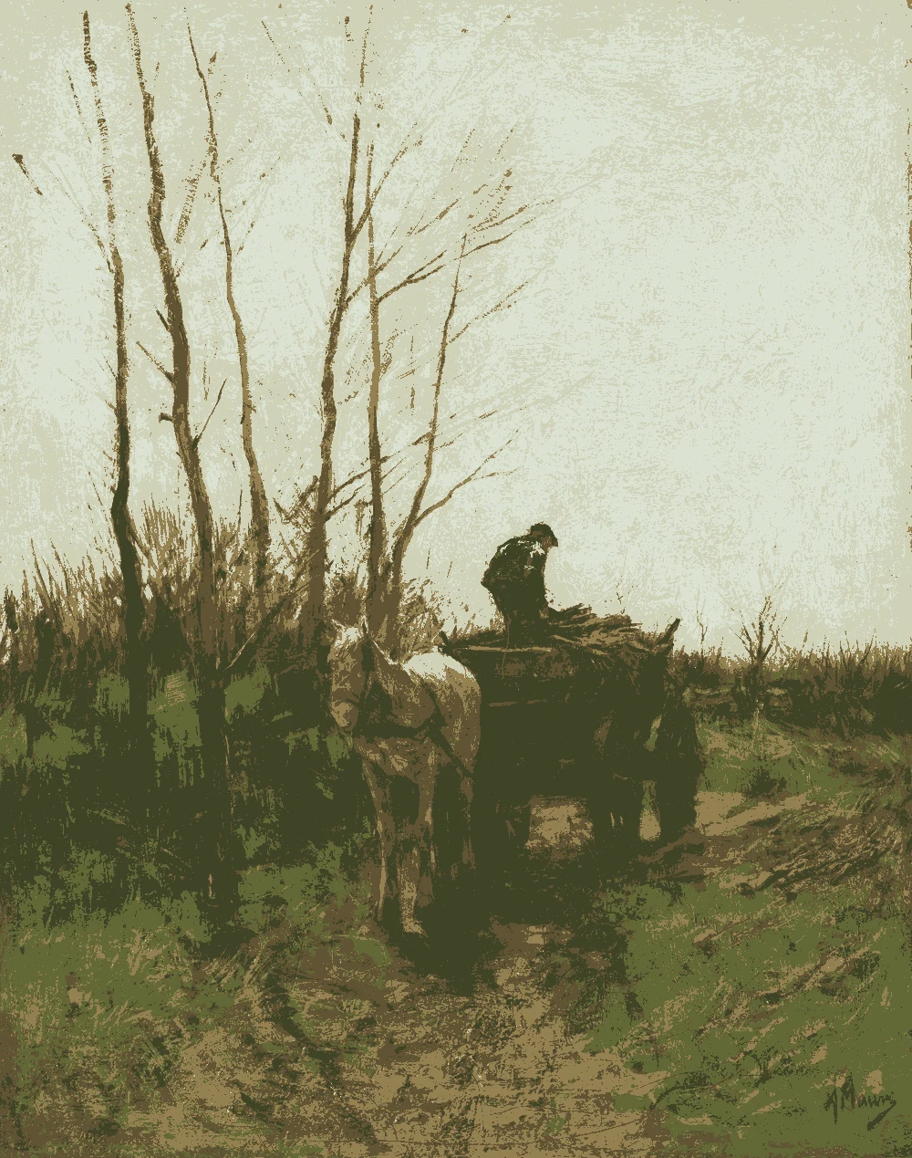
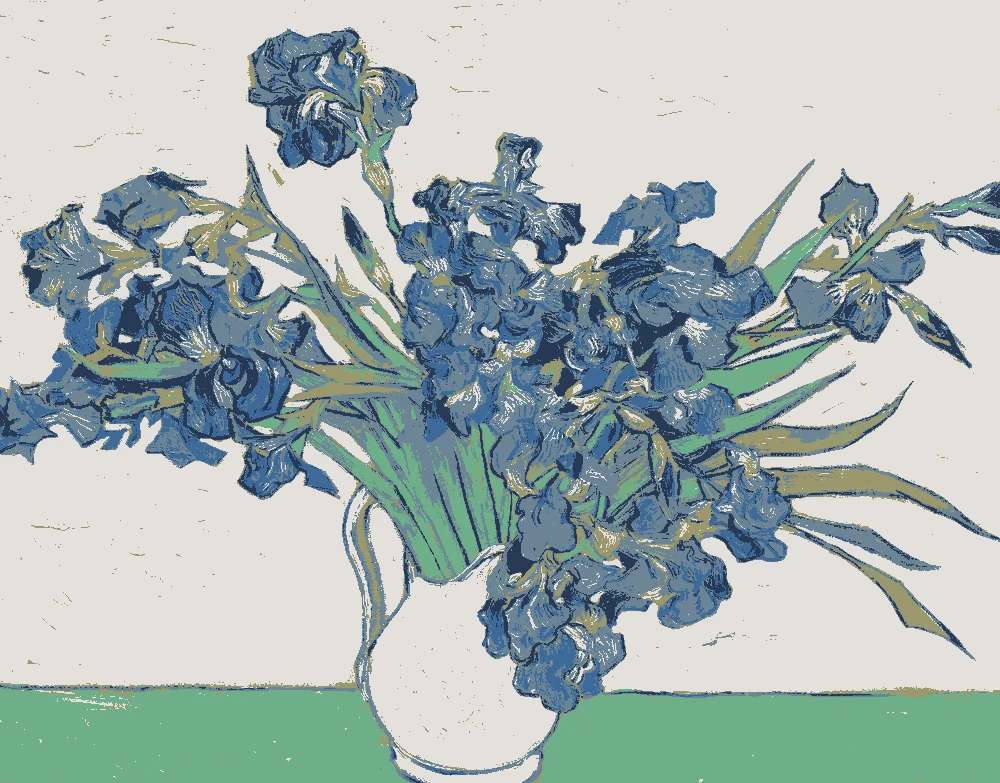
Left, every pixel of the canvas snapped to its nearest palette color. Right, the detail where each color is strongest.


The nearest color from each brand. “Near-identical” and “Very close” are hard to tell apart on a wall; with “Similar”, compare a sample with the painting. Brands with nothing close are left out.
| Painting color | Closest paints | LRV | Use it for |
|---|---|---|---|
Soft warm stone#C2BEA0 |
|
51 | Bed, sofa, curtains |
Warm walnut brown#967046 |
|
19 | Wood and frames |
Deep olive green#717850 |
|
18 | One bold piece |
Muted honey ochre#B99A5C |
|
34 | Small accents, art, accessories |
Pale cream yellow#DFDBAD |
|
69 | Main walls |
Bright yellow olive#A8AB4F |
|
38 | One small textile |
Paint names belong to their brands. Matches are measured from screen colors and are approximate; Light & Pigment is not affiliated with any paint brand.
The wall color shifted for the light it will live in. Check the version closest to your room before buying a sample.
#C7C9AFNorth light is cooler and softer, so the pale cream wall will look calmer and a little greyer. The warm stone may read slightly flat, so pair it with warmer lamps.
#E6DDB1Strong south light brings out the warm yellow in the cream wall, so it can look bright and sunny. The deep olive will hold its depth and keep the room from feeling washed out.
#C0AF81Warm evening bulbs deepen the yellow and brown tones, so the room will feel cozy. The deep olive accent will look richer, and the cream wall will take on a golden glow.
Pick which painting color goes on the walls, the big furniture and the bold piece. Floors, shadows and light follow your choices.
Wood takes Warm walnut brown and the rug border takes Bright yellow olive in every combination.
Details from the painting next to the colors and materials that carry them into a room.

A card with the painting, all 6 colors and a room scheme. Pin it, or take it to the paint store.
Yes. Its light reflectance value is 69, so it bounces light well. A pale wall like this helps a small room feel more open.
Use the pale cream, #DFDBAD, on the walls to reflect light. Keep the deep olive for a door or a single small accent so the space does not close in.
Balance the walnut brown and deep olive with the warm stone and cream. Use the lighter tones on walls and larger pieces, and keep the darkest colors to wood and small accents.
Image: The Metropolitan Museum of Art, Public domain (CC0). Palette, posterized image, details and room views generated by Light & Pigment from that image. Colors look different on screen than on a wall, so always test a sample.