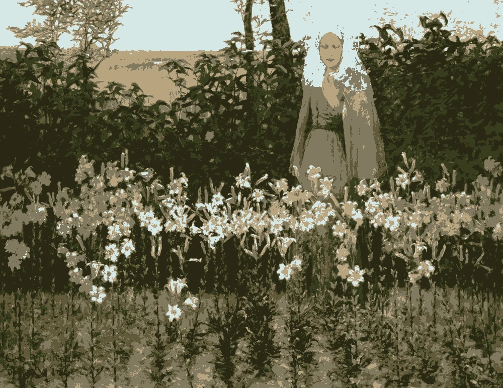
Rustic rooms use warm, earthy colors: cream, clay, olive brown and near-black. This palette gives you six, each measured from a painting, with its light reflectance value (LRV) and the closest paints. Use it for a cabin, a log home or a rustic modern room.
Quick answer
Use the warm cream on walls, the taupe on furniture or a feature wall, and the olive brown on wood. Keep terra cotta for one bold piece and the two darkest browns for small touches.
Every color on this page was measured from one of these public-domain paintings.
The palette
#47342BLRV 4
Espresso Brown
With an LRV of 4 and a warm red-orange undertone, this is best for a mantel, a pantry door or a small den accent. The color comes from 'After the Bullfight' by Mary Cassatt.
A deep color with a warm yellow undertone and an LRV of 11. Use it on beams, doors and built-ins, where it frames lighter walls. It was measured from Turner's 'Valley of Aosta: Snowstorm, Avalanche, and Thunderstorm.'
A mid-tone at LRV 27 with a warm red-orange undertone. Use it for the bold piece, such as a front door, an accent chair or one wall. It comes from Fra Bartolommeo's 'The Nativity.'
At LRV 72 this color reflects light, which makes it the best wall color for rooms with small windows. Its warm yellow undertone suits wood. It was measured from Thomas Cole's 'Distant View of Niagara Falls.'
At LRV 2 it is almost black, with a warm yellow undertone. Use it in textiles such as rugs, throws and curtains, where a small amount adds depth. It comes from George Hitchcock's 'The Annunciation.'
A mid-tone at LRV 19 with a warm yellow undertone. It suits main furniture, cabinets or a feature wall, and sits calmly between cream and the darker browns. It was measured from George Inness's 'Early Morning, Tarpon Springs.'
The same paint reads differently in cool north light, warm south sun and under evening lamps. Find the column closest to your room.
Color
Neutral daylight
North light
South light
Evening lamps
Terra Cotta Clay
Warm Cream
Try these colors in a room
Pick which color goes on the walls, the big furniture and the bold piece. Floors, shadows and trim follow your choice.
The framed picture on the wall is After the Bullfight.
How do I choose between these rustic colors?
Start with the wall. The cream, #E8DCC0, has an LRV of 72, so it reflects light and keeps a timber room from feeling like a cave. The taupe, #847565, sits at LRV 19. It works on a feature wall or on large furniture, but across a whole room it will read dark.
Then pick one dark and one warm accent. The deep olive brown, LRV 11, suits beams, doors and wood-toned built-ins. The terra cotta, LRV 27, is the bold piece: a front door, a chair, a single wall in a den. The espresso brown, LRV 4, and the near-black olive, LRV 2, are for small areas such as rugs, throws, a mantel or a pantry door.
For a whole house, use the cream in most rooms. Repeat the taupe and olive brown in a few places and let the darkest two appear in small amounts. Every color here has a warm undertone, so they sit together without clashing.
What goes with rustic colors: trim, ceiling and flooring?
For trim, the cream is the easiest choice against darker walls. On cream walls you have two options. Trim in the same cream gives a soft, low-contrast look. The deep olive brown, LRV 11, gives a clear frame around windows and doors. Avoid bright, cool whites. Next to these warm undertones they look blue and flat.
For ceilings, cream at LRV 72 bounces light back down and works in most rooms. If the room has real timber ceilings, leave the wood as it is and paint the walls cream so the beams stand out.
For flooring, medium to dark wood works with all six colors. Terra cotta suits a tile floor or a rug in a kitchen or entry. If your floor is already orange or red-toned, choose the taupe or olive brown for the walls instead of adding more terra cotta. Dark hardware ties in with the espresso brown and the near-black olive.
How do these colors behave in the light of the room?
Light changes these colors more than most. In a north-facing room the light is cool, so the cream can look slightly gray, and the taupe and olive brown go darker and flatter. In a south-facing room the same colors look warmer and the yellow undertones show more.
LRV tells you how much light a color gives back. The cream at LRV 72 bounces light and helps a room with small windows. The taupe at LRV 19 and the olive brown at LRV 11 absorb most of it. The espresso brown at LRV 4 and the near-black olive at LRV 2 take in almost everything, so a large wall in either one will feel enclosed unless the room has big windows.
Lamps matter too. Warm bulbs in the evening deepen the red-orange of the terra cotta and the espresso brown. Check each color at night as well as by day, and choose a matte or low-sheen finish so uneven walls show less glare.
How do I test these rustic paint samples?
Test before you buy, and test big. Paint a sample on poster board, or a patch about two feet square, and tape it to the wall. Move it to each wall of the room, because light changes from one wall to the next. Look at it in the morning, at midday and with the lamps on.
Hold the sample against your floor, your wood trim and your largest piece of furniture. These warm colors can pull in different directions next to orange or red wood.
Use the matches as a starting point. The cream has near-identical matches in Sherwin-Williams SW 6392 Vital Yellow and Behr HDC-NT-17 New Cream. The taupe has Sherwin-Williams SW 7514 Foothills as a near-identical match. The near-black olive, #2A2814, has no close commercial match, so use the hex value as a guide for fabric or a custom mix. Matches are made from the measured color, so the chip in your own room is the final check.
FAQ
What colors are in a rustic color palette?
This palette has six: warm cream, weathered taupe, deep olive brown, terra cotta clay, espresso brown and a near-black olive. All have warm red-orange or yellow undertones.
What is a good log cabin color palette?
Use warm cream on walls to bounce light, since logs and timber absorb a lot of it. Add the taupe and olive brown for furniture and doors, and keep the darkest browns for small accents.
How do I use these colors for a rustic modern look?
Keep the cream on most walls and use fewer colors overall. Choose one accent, such as the terra cotta, and add the near-black olive in small textiles for contrast.
What is a whole house rustic color palette?
Use cream as the base in every room, then repeat the taupe and olive brown in a few rooms. Place terra cotta and the darkest browns in small amounts so the house feels connected.
Will dark colors make a small cabin feel smaller?
They can. The espresso brown has an LRV of 4 and the near-black olive an LRV of 2, so they absorb nearly all light. In a small room, use them on a door, a rug or a throw, and keep the walls cream.
Save these colors
A card with every color on this page, its LRV and the paintings it comes from. Pin it, or take it to the paint store.
Painting images: The Art Institute of Chicago, public domain (CC0).
Colors measured by Light & Pigment. Paint names belong to their brands and matches are approximate. Colors look different on screen than on a wall, so always test a sample.


 From After the Bullfight, Mary Cassatt