Modern houses have simple shapes and flat planes, so a small palette works best: one wall color, one trim color, one door color and a charcoal or black roof. Below are four complete exterior schemes, each measured from a public-domain painting, with LRV values and the closest paint matches. Pick the one closest to your roof and fixed materials, then test it on the house.
Quick answer
Use a mid-tone or very dark color on the walls, a cream or black on the trim, garage door and fascia, and a different, deeper color on the front door and shutters. Keep the roof charcoal or black.
Every wall, trim and door color here was measured from one of these public-domain paintings.
4 complete exterior color schemes
Walls, trim, front door and roof together. Each scheme takes its colors from public-domain paintings, so the pairings are ones a painter already put side by side.
Greige and Bronze
Walls #C8BAB2
Trim #E8DDC8
Front door & shutters #967F5B
Roof: charcoal
Warm greige walls with cream trim and a bronze tan front door and shutters under a charcoal roof. A soft, low-contrast modern look that suits stucco or smooth siding.
Very dark brown walls with cream trim and a leaf green front door and shutters under a black roof. The light trim and green door stand out strongly against the walls.
Deep sage walls with cream trim and a dark umber front door and shutters under a charcoal roof. The dark door stays close to the walls, while the cream trim gives the outline.
Pale sage walls with soft black trim and an oxblood front door and shutters under a black roof. This is the highest-contrast scheme, with sharp lines around windows and the garage door.
Exterior paint is seen in much stronger light than a room. Full sun bleaches a color by a shade or two, while the shaded side of the house and overcast days pull it cooler and darker. Test a large sample on two sides of the house.
Color
Swatch
Full sun
Overcast
In shade
Golden hour
Warm Greige LRV 51
Dark Cocoa Brown LRV 4
Deep Sage Green LRV 13
Pale Sage LRV 75
Warm Cream White LRV 73
Try these colors on a house
Pick a color for the walls, the trim, the front door and the roof, and switch between house styles. Shadows and siding lines follow your choice.
Roof colors are typical shingle, tile and metal colors, not paint. Every other color comes from a painting on this page.
Colors for the walls
#C8BAB2LRV 51
Warm Greige
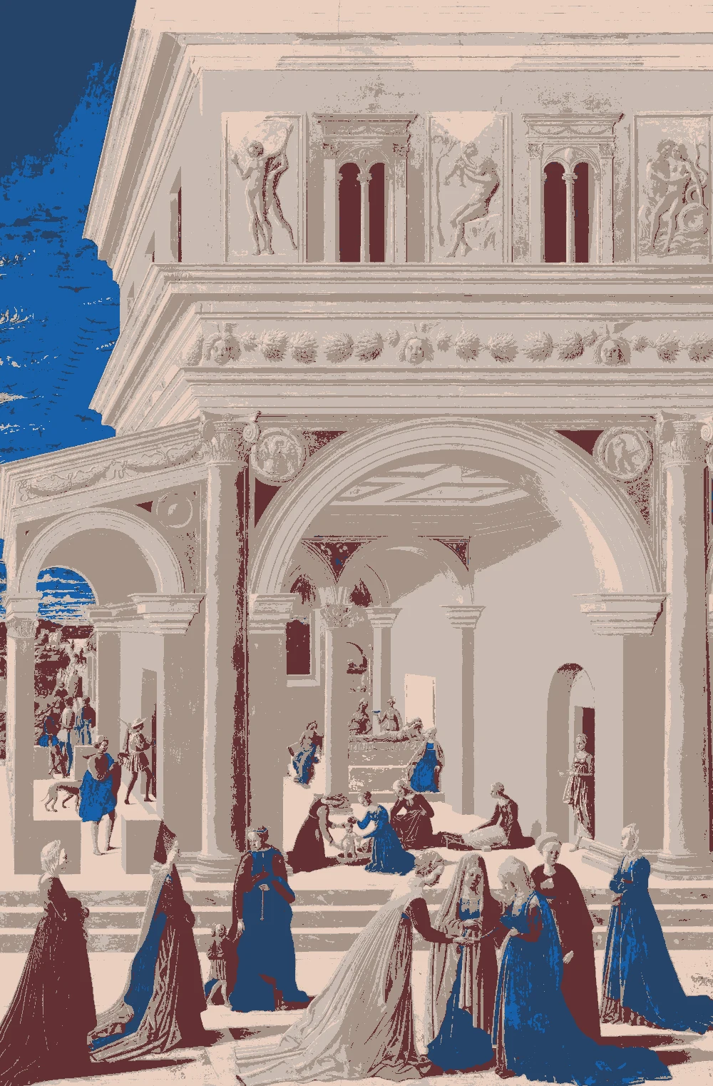
A light wall color with a warm red-orange undertone and an LRV of 51. It suits siding or stucco under a charcoal roof, and it comes from "The Birth of the Virgin" by Fra Carnevale. The closest match measured is Sherwin-Williams SW 6037 Temperate Taupe.
A very dark wall color with a warm red-orange undertone and an LRV of 4. It gives a modern house a strong, solid look with a black roof, and it comes from Rubens's "Saint Francis." The closest match measured is Sherwin-Williams SW 6006 Black Bean.
A deep wall color with a green undertone and an LRV of 13. It blends a house into trees and lawn, and it comes from "The Afternoon Meal (La Merienda)" by Luis Meléndez. The closest match measured is Sherwin-Williams SW 6187 Rosemary.
A very light wall color with a green undertone and an LRV of 75, so it reads light and bounces light. Use it on a house that gets little sun, and remember it will look paler in full sun. It comes from Théodore Rousseau's "Landscape," and Sherwin-Williams SW 6175 Sagey is a near-identical match.
A very light trim color with a warm yellow undertone and an LRV of 73. Use it on trim, fascia and the garage door against mid-tone or dark walls. It comes from Pissarro's "The Garden of the Tuileries on a Winter Afternoon," and Sherwin-Williams SW 6119 Antique White is a near-identical match.
Sherwin-Williams SW 6119 Antique White
Near-identical
Valspar 7003-9 Malted Milk
Near-identical
Behr PPU8-14 Silky Bamboo
Very close
#151107LRV 1
Soft Black
A very dark trim color with a warm yellow undertone and an LRV of 1. It draws a sharp outline around windows, fascia and garage door on a pale wall. It comes from Rousseau's "Landscape." No close commercial match was found, so compare black samples on the wall.
Sherwin-Williams SW 6258 Tricorn Black
Nearest available
Front door and shutter colors
#967F5BLRV 22
Bronze Tan
A mid-tone door color with a warm yellow undertone and an LRV of 22. It gives a warm accent on the greige walls without a harsh jump in value. It comes from Pissarro's "The Garden of the Tuileries on a Winter Afternoon," and Sherwin-Williams SW 6138 Artifact is a near-identical match.
A mid-tone door color with a green undertone and an LRV of 21. Against a very dark wall it stands out clearly, so it works for a front door and shutters. It comes from Pissarro's "The Garden of the Tuileries on a Winter Afternoon," and Behr 410F-6 Grape Vine is a near-identical match.
A very dark door color with a warm yellow undertone and an LRV of 2. On deep green walls it makes a quiet, tonal door and shutters. It comes from the "Portrait of Philip IV" by the Workshop of Velázquez. No close commercial match was found, so compare dark brown samples.
A very dark door color with a warm red-orange undertone and an LRV of 3. It adds depth to a front door against pale walls. It comes from Degas's "Portrait of a Woman in Gray," and Sherwin-Williams SW 2801 Rookwood Dark Red is a very close match.
Start with what will not change. The roof, brick, stone, concrete and window frames stay put, so the wall color has to sit well beside them. Hold a large sample next to each one and compare the undertone, not just the depth.
The roofs in these schemes are charcoal or black. Both work with every wall color shown here. Warm greige suits a charcoal roof. A very dark brown or a pale sage pairs well with black.
Then decide how light or dark the house should be. The LRV tells you. A wall near 75, like the pale sage, reads light and bounces light. A wall at 13 reads deep and quiet. A wall at 4 reads almost black.
Modern houses have simple shapes and large flat planes, so the wall color carries the whole look. Pick one clear color for the walls and keep the rest of the palette small.
How much contrast should trim and the front door have?
Modern exteriors rely on clean lines, so decide how sharp you want the edges. Trim sets the outline of the house. The front door sets the focal point.
For a soft look, use light trim on mid-tone walls. The warm cream trim has an LRV of 73 and sits well against greige at 51 and deep green at 13. The gap is clear but gentle.
For a graphic look, reverse it. Soft black trim at LRV 1 on pale walls at LRV 75 draws a sharp line around windows, fascia and garage door. It is the strongest contrast on this page.
Keep the front door in a different color family from the walls, or much darker. Door colors with an LRV between 2 and 22 stand out against light walls. On a very dark wall, the leaf green at 21 reads as a clear accent. Use the same color on shutters, and the same trim color on fascia and garage door, so the house has only three or four colors in total.
Why do exterior colors look different in sun and shade?
Paint on a large wall looks different from a small chip. In full sun, an exterior color usually looks lighter and can look washed out. In shade, it looks cooler and darker. A big wall in bright light often reads paler than you expect.
So choose one shade darker than the color you like on the chip. This matters most for light colors. A warm greige at LRV 51 may look much paler on a sunny wall and flatter on a shaded one.
Undertones shift too. A green undertone looks fresher in open sun and grayer in shade. A red-orange undertone looks warmer in low evening light and softer under a cloudy sky. Very dark colors, like the brown at LRV 4, can show their undertone in direct sun, while in shade they read as near black.
Trim and doors follow the same rule. Cream trim may look warmer beside gray-green walls in shade. Always judge it next to the wall, not on its own.
How should you test exterior paint samples?
Test on the house, not on a chip. Paint a sample at least two feet square, or paint a board and move it around. Apply two coats so the color is true. Leave a white border so the sample does not blend into the old color.
Put samples on two sides of the house, ideally one that gets morning sun and one that sits in shade. Look at them in the morning, at midday, in late afternoon and in the evening. If you can, check them on a cloudy day as well.
Place the samples next to the fixed parts: the roof edge, brick, stone, garage door and walkway. Hold the trim and door samples against the wall sample. Then step back to the street and look from there, since that is where the house is seen.
Give it a few days. Choose the color that still looks right on both sides and at each hour. If two samples are close, pick the darker one.
FAQ
What are good modern exterior color combinations?
Four complete combinations are shown above: warm greige with cream trim and a bronze tan door, dark brown with cream trim and a leaf green door, deep sage with cream trim and a dark umber door, and pale sage with soft black trim and an oxblood door. Each one has a charcoal or black roof.
What is a good mid century modern exterior color palette?
The warm, earthy schemes here are a good starting point: greige with cream trim and a bronze tan door, or deep sage with cream trim and a dark door. Keep the roof charcoal or black and use the same door color on shutters.
How many colors should a modern house exterior have?
Three or four. Use one wall color, one trim color for trim, fascia and garage door, one door color for the front door and shutters, and a charcoal or black roof.
What roof color goes with a modern exterior?
Charcoal and black both work with all four schemes on this page. Check the roof against the wall sample, and match the undertone of any brick or stone that stays.
Can a modern house be painted a very dark color?
Yes. The dark cocoa brown here has an LRV of 4 and reads almost black, and the deep sage has an LRV of 13. Pair a very dark wall with light trim, such as cream at LRV 73, and test it in both sun and shade first.
Save these colors
A card with these house color schemes: walls, trim, front door and roof. Pin it, or take it to the paint store.
Painting images: The Metropolitan Museum of Art, The Art Institute of Chicago, public domain (CC0).
Colors measured by Light & Pigment. Paint names belong to their brands and matches are approximate. Colors look different on screen than on a wall, so always test a sample.