19th-century French painting · art-to-room palette
Three Jockeys Color Palette & Paint Colors
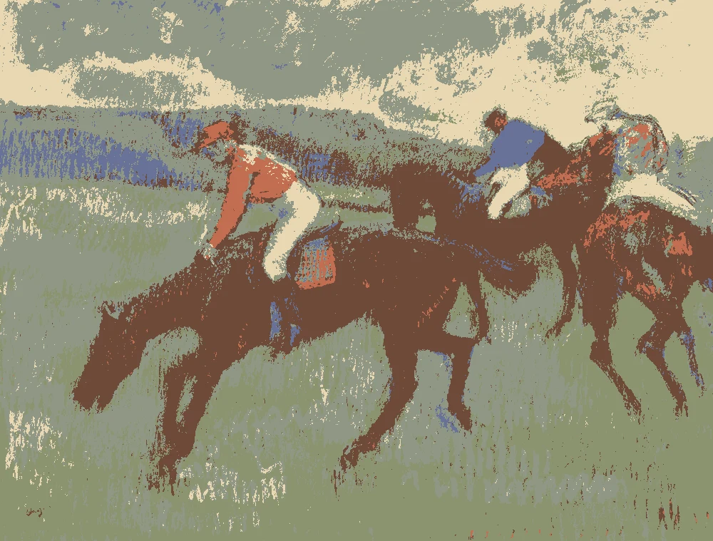
This palette comes from Edgar Degas's pastel "Three Jockeys" (ca. 1900, The Metropolitan Museum of Art). It is built on muted sage and olive greens, with a deep red-brown and a warm pale cream, so it suits rooms that want calm color with a little warmth.
Quick answer
Use the warm cream #E9D8B3 on the walls to keep the room light. Let the sage #8F9785 carry the largest upholstered or painted pieces, use the olive #8B936F for smaller accents, and bring in the deep brown #6E4A38 for wood. The terracotta #C16E50 works best as a small textile accent.
The nearest color from each brand. “Near-identical” and “Very close” are hard to tell apart on a wall; with “Similar”, compare a sample with the painting. Brands with nothing close are left out.
Paint names belong to their brands. Matches are measured from screen colors and are approximate; Light & Pigment is not affiliated with any paint brand.
How warm pale cream looks in your light
The wall color shifted for the light it will live in. Check the version closest to your room before buying a sample.
North-facing room#CDC6B2
In north light, the cream wall will look cooler and a little grayer than its warm yellow undertone suggests. The sage and olive will feel quieter and more gray. A room with this light may need the warm wood and rust textile to keep it from feeling flat.
South-facing room#EEDBB6
In strong south light, the cream wall will look bright and warm, and it can start to look almost white. The sage and olive will look clearer and more green. Keep the deep brown wood in shade or in smaller amounts so it does not look heavy in the brightest sun.
Evening, warm lamps (2700K)#C5AD84
Under warm evening bulbs, the yellow undertone of the cream will move forward and the room will look softer and more golden. The sage will read warmer and slightly deeper. The rust textile and brown wood will look especially rich under these lights.
Try the palette in a room
Pick which painting color goes on the walls, the big furniture and the bold piece. Floors, shadows and light follow your choices.
Wood takes Deep red-brown and the rug border takes Muted terracotta rust in every combination.
Mood board
Details from the painting next to the colors and materials that carry them into a room.
Warm pale cream
Soft sage gray-green
Muted olive sage
LinenOiled oakLime plasterAged brass
Save this palette
A card with the painting, all 6 colors and a room scheme. Pin it, or take it to the paint store.
You can, but the cream has a light reflectance value of 70, so a room painted entirely in it will feel bright. Many people use it on the main walls and add the deeper sage or olive on one wall or in furnishings for contrast.
Will the sage look the same in every room?
No. Its reflectance value is 30, so it will shift with the light. It will look grayer in north light, greener in south light, and warmer under evening bulbs. Test a large sample on the wall you plan to paint and check it at different times of day.
Which wood tone works with this palette?
The deep red-brown #6E4A38, with a reflectance value of 8, is the closest match to the wood in the painting. It grounds the sage and cream and pairs well with the rust textile. Keep it in doors, trim, or furniture where it does not overpower the lighter walls.
Image: The Metropolitan Museum of Art, Public domain (CC0).
Palette, posterized image, details and room views generated by Light & Pigment from that image.
Colors look different on screen than on a wall, so always test a sample.