Mediterranean Color Scheme for Interior Walls, Wood and Textiles
A Mediterranean color scheme mixes a warm plaster cream with coral, olive gold and sea blue, then grounds them with dark brown and deep teal. Each of the six colors below was measured from a public-domain painting and comes with its LRV and the closest commercial paints.
Quick answer
Use the cream (LRV 73) on the walls, olive gold on main furniture, dark bronze brown on wood, coral as the bold piece and deep teal on textiles.
Every color on this page was measured from one of these public-domain paintings.
The palette
#CD8F83LRV 34
Dusty Coral Rose
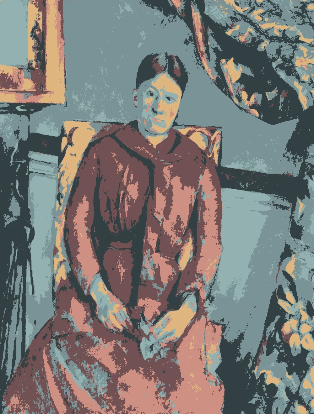
A mid-tone with a warm red-orange undertone and an LRV of 34. Use it on one accent wall, a painted chair or a cabinet, where it reads as a soft dusty rose rather than a bright pink. Measured from Paul Cézanne's "Madame Cézanne (Hortense Fiquet, 1850–1922) in a Red Dress" (1888–90).
Sherwin-Williams SW 6325 Constant Coral
Very close
Valspar 2001-8A Field of Flowers
Very close
Behr MQ4-32 Vintage Coral
Close
Farrow & Ball No. 64 Red Earth
Similar
#B39E59LRV 35
Olive Gold
A mid-tone with a warm yellow undertone and an LRV of 35. It suits a sofa, a leather chair or a sideboard, and it sits well against the cream walls. Measured from Pierre-Auguste Renoir's "Acrobats at the Cirque Fernando (Francisca and Angelina Wartenberg)" (1879).
A cool blue mid-tone with an LRV of 34. It cools down a warm room, so try it on a bedroom wall, a kitchen island or shutters. Measured from Paul Cézanne's "Bathers" (1874–75).
Sherwin-Williams SW 9070 Baby Blue Eyes
Very close
Behr BXC-88 Cool December
Very close
Farrow & Ball No. 86 Stone Blue
Close
#EBDCC4LRV 73
Warm Plaster Cream
A very light color with a warm yellow undertone and an LRV of 73, so it reflects plenty of light. Use it on walls and ceilings in living rooms, halls and bedrooms. Measured from Paul Gauguin's "Arlésiennes (Mistral)" (1888).
A deep color with a warm yellow undertone and an LRV of 7. Keep it to wood beams, doors, window frames and a dining table, where it adds weight without darkening the whole room. Measured from Eugène Delacroix's "Lion Hunt" (1860–61).
Sherwin-Williams SW 7055 Enduring Bronze
Very close
Behr S-H-700 Burley Wood
Close
Valspar 6009-3 Montana Moss
Close
Farrow & Ball No. 255 Tanner's Brown
Similar
#4F7577LRV 16
Deep Lagoon Teal
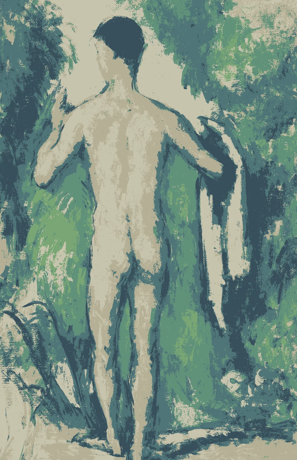
A deep, cool blue-green with an LRV of 16. It works best on curtains, a rug or an upholstered chair, or on a small wall in a room with strong daylight. Measured from Paul Cezanne's "Standing Bather, Seen from the Back" (1879-82).
The same paint reads differently in cool north light, warm south sun and under evening lamps. Find the column closest to your room.
Color
Neutral daylight
North light
South light
Evening lamps
Dusty Coral Rose
Olive Gold
Soft Sea Blue
Warm Plaster Cream
Try these colors in a room
Pick which color goes on the walls, the big furniture and the bold piece. Floors, shadows and trim follow your choice.
The framed picture on the wall is Madame Cézanne (Hortense Fiquet, 1850–1922) in a Red Dress.
How do you choose between these Mediterranean colors?
Start with the walls. The cream, #EBDCC4, has an LRV of 73, so it reflects light and keeps a room open. It is the safest base for living rooms, hallways and bedrooms. The closest matches measured are Sherwin-Williams SW 7573 Eaglet Beige, Behr N280-2 Writers Parchment and Farrow & Ball No. 2013 Matchstick, all near-identical.
Then pick one mid-tone to carry the personality. The coral, the gold and the blue sit at an LRV of 34 or 35, so they have almost the same weight. On a big wall they all feel equally strong. Choose one for a feature wall or a large piece of furniture and keep the other two small.
Use the two deep colors as anchors. The bronze brown, at LRV 7, suits wood, beams and door frames. The teal, at LRV 16, suits curtains, a rug or an armchair. A simple rule is one cream, one mid-tone, one deep color, and only small touches of the rest.
What goes with this palette: trim, ceiling and flooring?
For trim, use the same cream as the walls. The result is soft and plaster-like, with no hard edge between wall and frame. Avoid a bright white next to #EBDCC4. Its warm yellow undertone can make a stark white look cold beside it.
For the ceiling, use the cream as well, or ask the store to mix it at half strength for a slightly lighter lid. A light ceiling bounces daylight back into the room.
For flooring, dark wood in the range of the bronze brown (LRV 7) gives a strong base. Warm clay, sand or stone tile also works and lets the coral and gold feel at home. If the floor is already warm, bring in the blue and teal through rugs and cushions to balance it.
For hardware and lighting, dark iron or aged brass suits all six colors. Keep the finishes matte or low sheen so the colors look like plaster, not plastic.
How do these colors behave in different light?
North-facing rooms get cooler, grayer light. The cream's warm yellow undertone keeps it from turning dull there, but the soft sea blue (LRV 34) will look cooler and flatter. If you want the room to feel warmer, put the coral or gold on the wall and keep the blue for fabrics.
South and west-facing rooms get warm, strong light. It can push the coral toward orange and the gold toward yellow. The blue and the teal work well here because they pull the room back toward balance.
The bronze brown has an LRV of 7, so it absorbs most of the light that hits it. On a whole wall in a small or dim room it will feel heavy. Keep it to wood and trim in those spaces.
Evening lamplight is yellow too. Check your colors at night as well, since the cream will look deeper and the blue greener.
How should you test these colors at home?
Hex values on a screen never match paint exactly, so treat them as a guide. Buy sample pots of the matches given and paint each on a large board, about two feet square, in two coats. Leave a white border around the color so the wall behind it does not change how you read it.
Move the boards around the room. Look at them in the morning, the afternoon and the evening. Hold each one next to your floor, your largest furniture and your curtains, since those will change how the color looks.
Pay attention to how close each match is. Several are near-identical, but others are only very close or close, such as Farrow & Ball No. 86 Stone Blue for the blue. Test the actual paint you plan to buy.
Live with the boards for two or three days before you commit. If a color still looks right on day three, it will probably look right on the wall.
FAQ
What colors make up a Mediterranean color scheme?
This palette has six: warm plaster cream, olive gold, dusty coral rose, soft sea blue, deep lagoon teal and dark bronze brown. Cream goes on the walls, and the others go on furniture, wood and fabrics.
What is a good color palette for a Spanish style home interior?
Start with the cream walls (LRV 73), add dark bronze brown (LRV 7) for beams and doors, and bring in coral or gold as an accent. Use teal or blue for cushions, rugs and curtains.
Which color here is a dusty rose?
The dusty coral rose, #CD8F83, has an LRV of 34 and a warm red-orange undertone. The closest matches measured are Sherwin-Williams SW 6325 Constant Coral and Valspar 2001-8A Field of Flowers, both near-identical.
Can I use this palette for a Tuscan color scheme?
Yes. For a warmer, Tuscan-leaning look, use the cream, olive gold, coral and bronze brown, and keep the blue and teal to small touches or leave them out.
What is the best wall color for a small Mediterranean room?
Choose the warm plaster cream. Its LRV of 73 reflects light and makes a small room feel bigger. Add the darker colors in furniture and fabrics rather than on the walls.
Save these colors
A card with every color on this page, its LRV and the paintings it comes from. Pin it, or take it to the paint store.
Painting images: The Metropolitan Museum of Art, The Art Institute of Chicago, public domain (CC0).
Colors measured by Light & Pigment. Paint names belong to their brands and matches are approximate. Colors look different on screen than on a wall, so always test a sample.


 From Madame Cézanne (Hortense Fiquet, 1850–1922) in a Red Dress, Paul Cézanne